Columns
Several column options allow for individual customization. The most important column option is the Width. This option can be set directly within the row from the top left dropdown of each column or via the options popup.
note
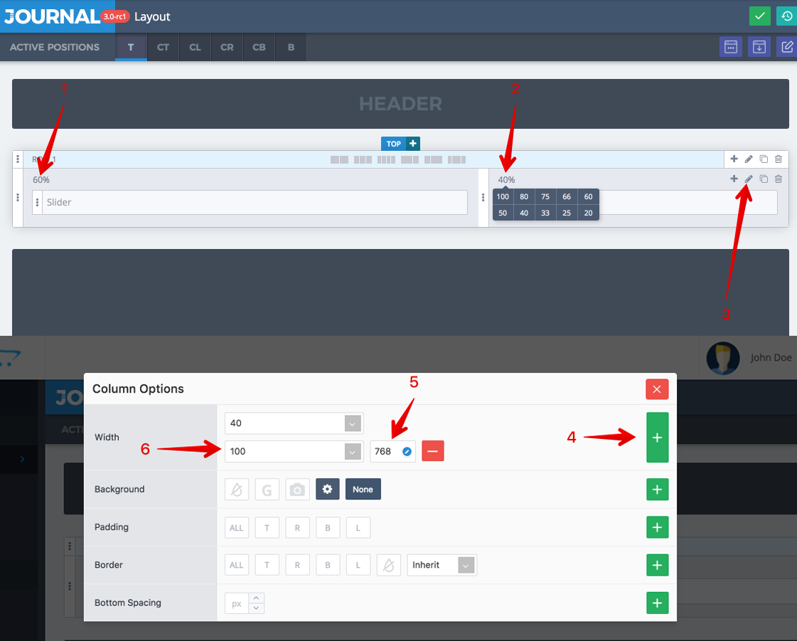
For full control over your layout responsive column width needs to be set inside the column options popup. Click the Edit Column button, add new breakpoints and indicate the column width for each screen width as required by your design. See below explanations.
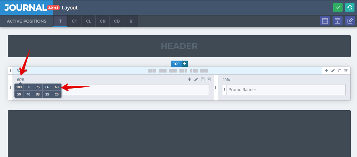
- Initial Column width. This is the width the column occupies within the row at all resolutions.
- Different column with a different width. Each column needs an explicit width and together must sum up to 100%. In this example we have two columns with a 60/40 but any number of columns and width combinations are possible.
- Column options, opens in Popup. Essential for responsive setup. Always visualize your layout at all resolutions and adjust column width accordingly.
- After the popup is opened add a breakpoint for the width property.
- Select a breakpoint (you can set up more breakpoints, or edit the existing one from Journal > Variables > Breakpoints).
- Finally choose the width the column should occupy at desired resolution. Do the same for the first column. So in this example the 2 columns will both become 100% and stack on top of each other below 768px screen width. Play around with these options and go with the best fit for your own content.