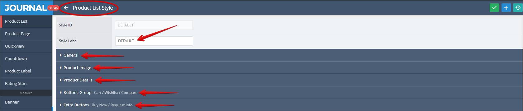
Product List Style
Product List Style is styled in Journal > Styles > Product List > [Active Style] (DEFAULT in our case)... . The settings are grouped under 5 tabs: General, Product Image, Product Details, Buttons Group (Cart / Whishlist / Compare) and Extra Buttons (Buy Now/ Request Info).
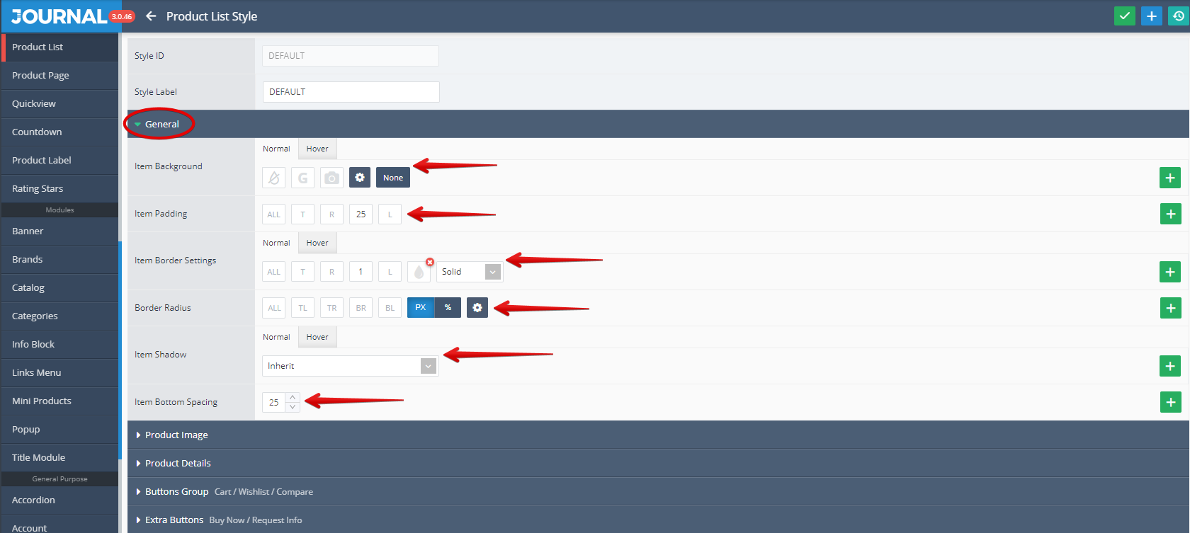
Under the General tab settings like Item Background, Item Padding, Item Border, Border Radius, Item Shadow and Item Bottom Spacing can be apply.
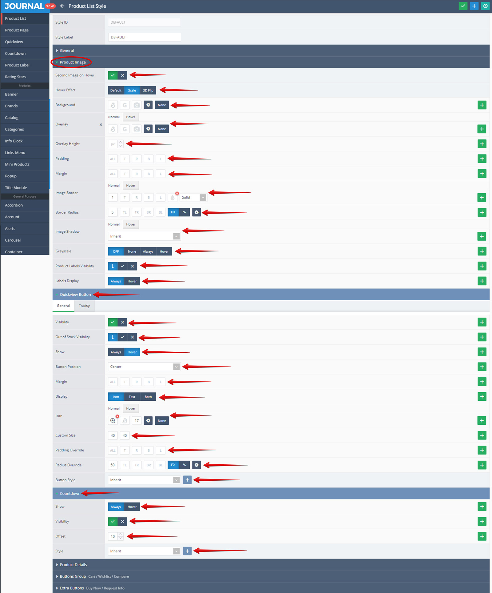
Under the Product Image tab the following settings can be apply: Second Image on Hover (Visibility ON or OFF), Hover Effect, Background, Overlay, Overlay Height, Padding, Margin, Image Border, Border Radius, Image Shadow, Grayscale, Product Labels Visibility and Labels Display. In addition, there are 2 sub-tabs as follows:
Quickview Button - where the following settings can be apply: Visibility (ON or OFF), Out of Stock Visibility, Show, Bottom Position, Margins, Display, Icon , Custom Size, Padding Override, Radius Override and most important Button Style.
Countdown - where the following settings can be apply: Show, Visibility (ON or OFF), Offset and Style.
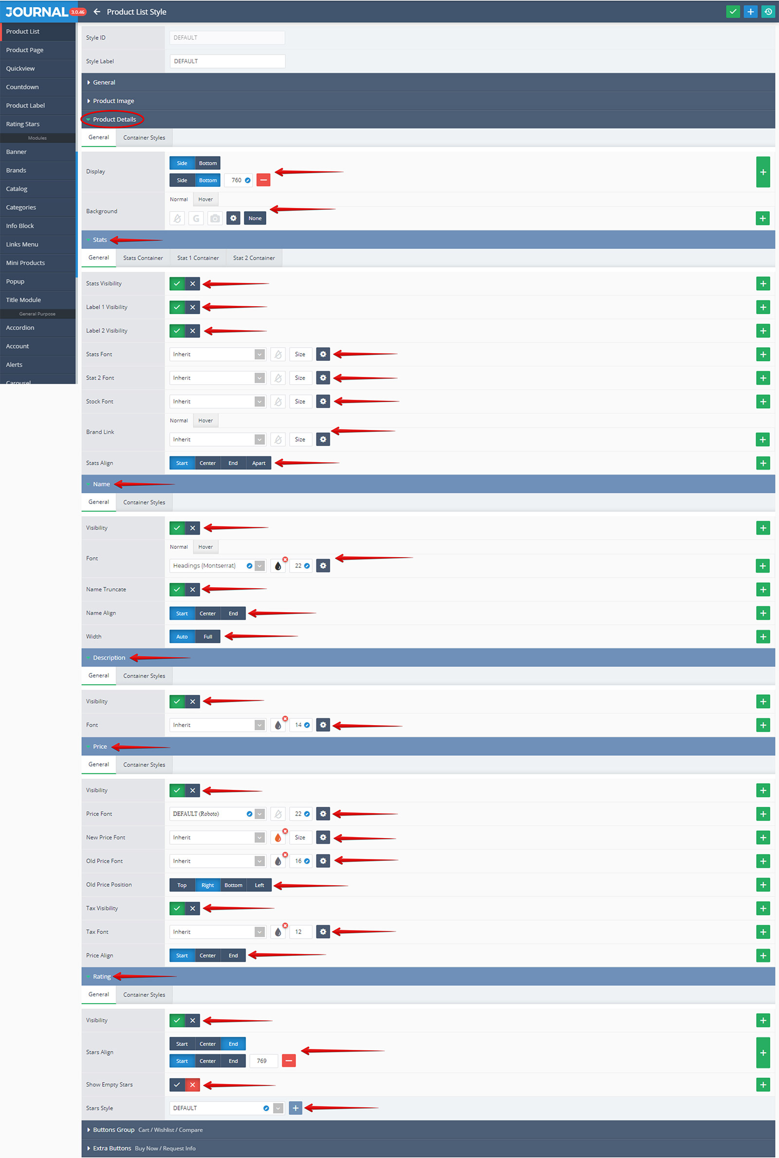
Under the Product Details the following settings can be apply: Display and Background. In addition, there are 5 sub-tabs one for each major group of options :
Stats - where the following settings can be apply: Stats Visibility, Label 1 and Label2 Visibility, Stats Font, Stat 2 Font, Stock Font, Brand Link and Stats Align;
Name - where the following settings can be apply: Stats Visibility, Font, Name Truncate, Name Align and Width;
Description - where the following 2 settings can be apply: Visibility and Font;
Price - where the following settings can be apply: Visibility, Price Font, New Price Font, Old Price Font, Old Price Position, Tax Visibility, Tax Font and Price Align.
Ratings - where the following settings can be apply: Visibility, Stars Align, Show Empty Stars and most important the Stars Style (in our case was used the DEFAULT style).
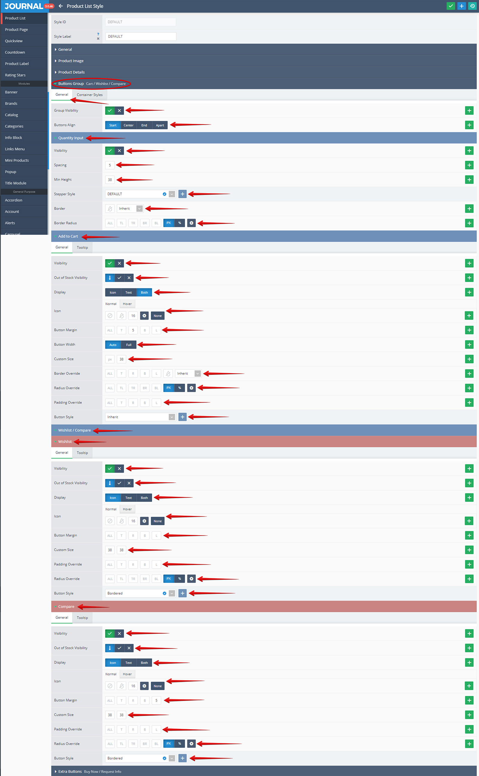
Under the Buttons Group (Cart / Whishlist / Compare) tab there are first 2 General settings Group Visibility and Buttons Align, followed by 3 sub-tabs:
Quantity Input - where the following settings can be apply: Visibility, Spacing, Min Height, Stepper Style (in our case was used the DEFAULT style), Border and Border Radius;
Add to cart - where the following settings can be apply: Visibility, Out Of Stock Visibility, Display, Icon, Button Margin, Button Width, Custom Size, Border Override, Radius Override, Padding Override and most important the Button Style (in our case was used once the Inherit style)
Whishlist / Compare - where there are 2 dedicated sub-tabs:
Whishlist - where the following settings can be apply: Visibility, Out Of Stock Visibility, Display, Icon, Button Margin, Custom Size, Padding Override, Radius Override and most important the Button Style (in our case was used Bordered style).
Compare - where the following settings can be apply: Visibility, Out Of Stock Visibility, Display, Icon, Button Margin, Custom Size, Padding Override, Radius Override and most important the Button Style (in our case was used Bordered style).
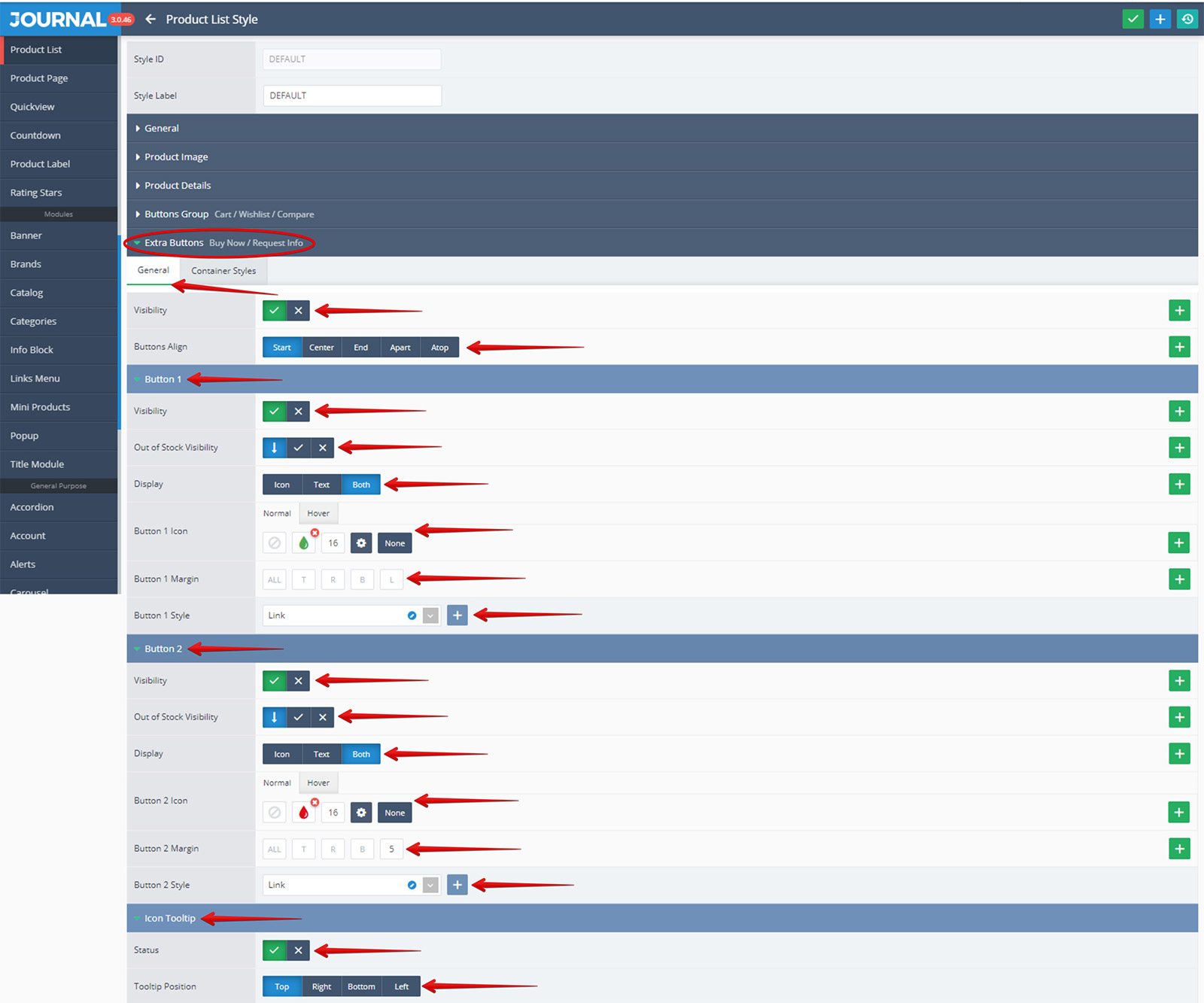
Under the Extra Buttons (Buy Now/ Request Info) tab there are first some General settings such as Visibility, Buttons Position and Buttons Align followed by 3 sub-tabs:
Button 1 - where the following settings can be apply: Visibility, Out Of Stock Visibility, Display, Button 1 Icon, Button 1 Margin and most important the Button 1 Style (in our case was used Link style).
Button 2 - where the following settings can be apply: Visibility, Out Of Stock Visibility, Display, Button 2 Icon, Button 2 Margin and most important the Button 2 Style (in our case was used Link style).
Icons Tooltip - where the following 2 settings can be apply: Status and Tooltip Position.
List Style is one option for displaying a Product Listing. This can be selected from Journal > Skins > Edit > Product Listing > General > Default View by pushing the button labeled "List" . Once the List Style is selected as Default View, additional settings can be applied to it, by using the Product List Style option.

The Product List Style allow you to select from a list of predefined styles created in Journal > Styles > Product List > .... If the Quick Edit is selected (click on the blue small pencil button) the selected List Style can be edited.
The settings available in the Product List Style section from Journal Admin are pretty similar with the ones included in Product Page Style section, fully described in our documentation on Products.
One additional setting not presented in Product Page Style is the Quickview Button and for that reason we will enter into more details related only to this particular feature.
Quickview Button is a feature added to a product which is displayed in a list and it is in fact a button situated right in the middle of the product picture (see below).

When the button is hit a dedicated window is open in which are presented the product details, similar with the ones included in the Product Page.

The above mentioned window associated with the Quickview Button can be styled from Journal > Styles > Quickview > ... with similar options as in the Product Page window (see below).

Quickview Button section from Journal Admin allow to set ON or OFF the Visibility for the Quickview button. In addition there are options for Out of Stock Visibility, Button Position, Margin, Display, Icon, Custom Size, Padding Override, Radius Override and Button Style. The Quickview Button uses a Button style created in Journal > Styles > Button > ....
The Countdown section from Product List Style has an additional feature by allowing to set up the Offset. Please note that the Countdown is generally styled in _Journal > Styles > Countdown > ... and is included also in the Product Page Style.
The Extra Button section from Product List Style has also an additional feature by allowing to set the Icon Tooltip (The Status and The Tooltip Position).