Mobile Testing on Desktop
Journal employs dedicated mobile layouts via an advanced Status mechanism which renders entire modules, menu items and other elements on selected devices: Desktop / Tablet / Phone.
In order to properly test your mobile layouts you need an actual mobile user agent, simply resizing the desktop browser window will not render the device specific modules.
Mobile Testing in Chrome Desktop Browser
If you don't have a real mobile device handy, you can use the Chrome (or Firefox) desktop browsers.
Open the Chrome code inspector with Ctrl + Shift + J (Cmd + Opt + J) or from the menu View > Developer > Developer Tools.
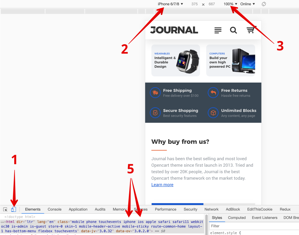
- Click on the Toggle device toolbar button,
- Choose device type,
- Set view to 100% (if needed).
- Reload the page (IMPORTANT!),
- Notice device specific classes on html tag.