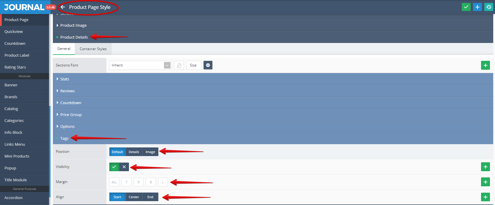
Product Page Style
The style for the Product Page is created in Journal > Styles > Product Page... and assigned to the product page in _Journal > Skins > Edit > Product Page > Product Page Style.
Storefront View
Admin View
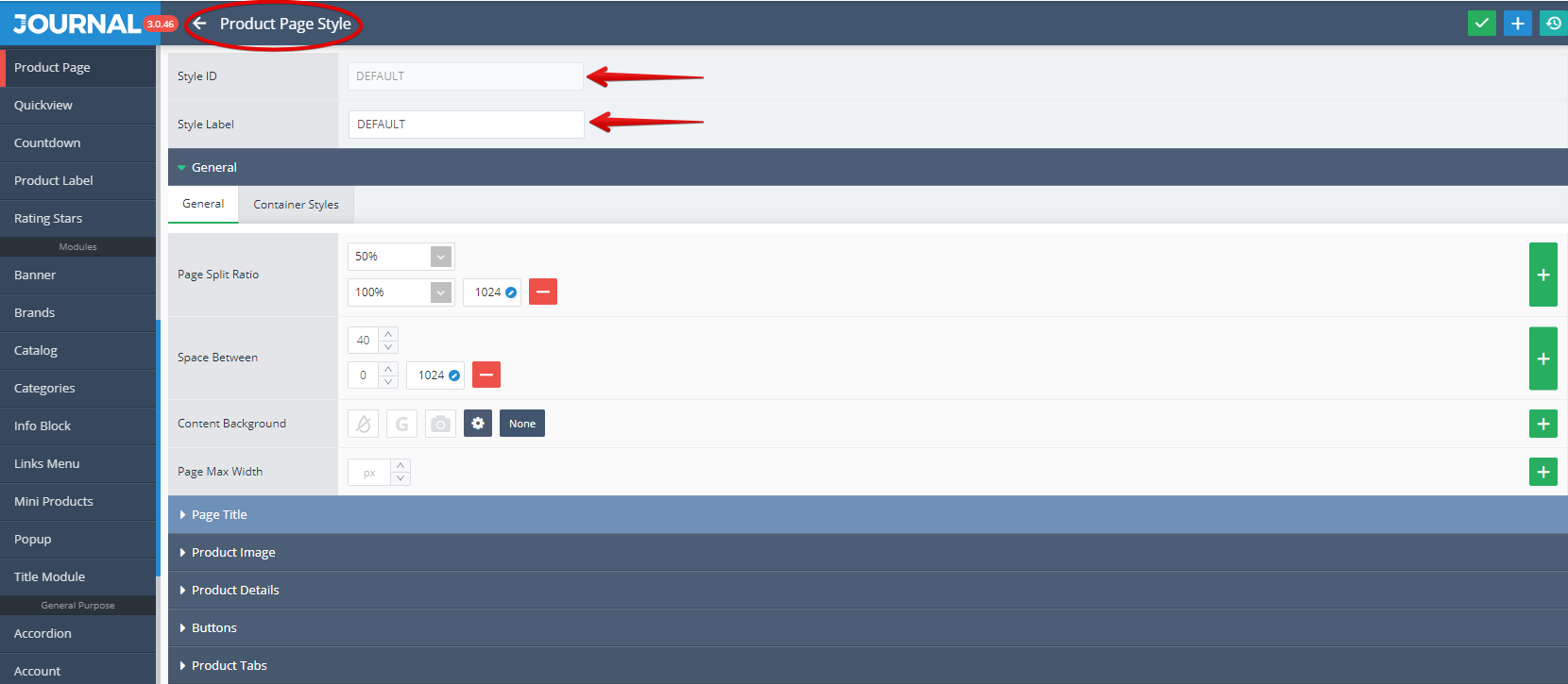
The Style ID (marked with a red arrow in the above picture) is a unique identifier which is automatically named upon creation. Do not change this after using it in other style options as it will deselect the associated variable.
You can use the Style Label (marked also with a red arrow in the above picture) for descriptive namings. The Style Label can always be changed later without affecting the associated variable use.
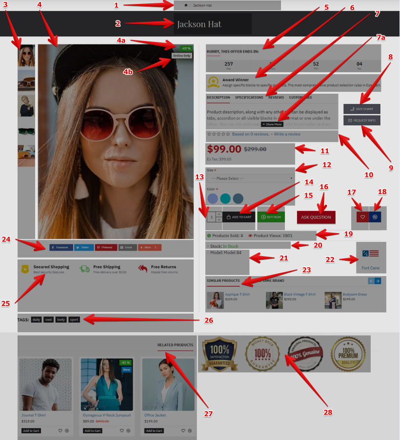
We will start the Product Page Style presentation with the option number 1 - Breadcrumbs.
- Breadcrumbs. Is used for navigation between the Home page and Product Page and usually is situated on top (left or center) of the Product Page, just below the page header.
Storefront View

For information related to the Breadcrumbs style please read our documentation on Breadcrumbs.
- Page Title. Is used for display the Product name as a title for the page. This element is also usually situated in the Top section of the page.
Storefront View

For information related to the Page Title style please read our documentation on Page Title.
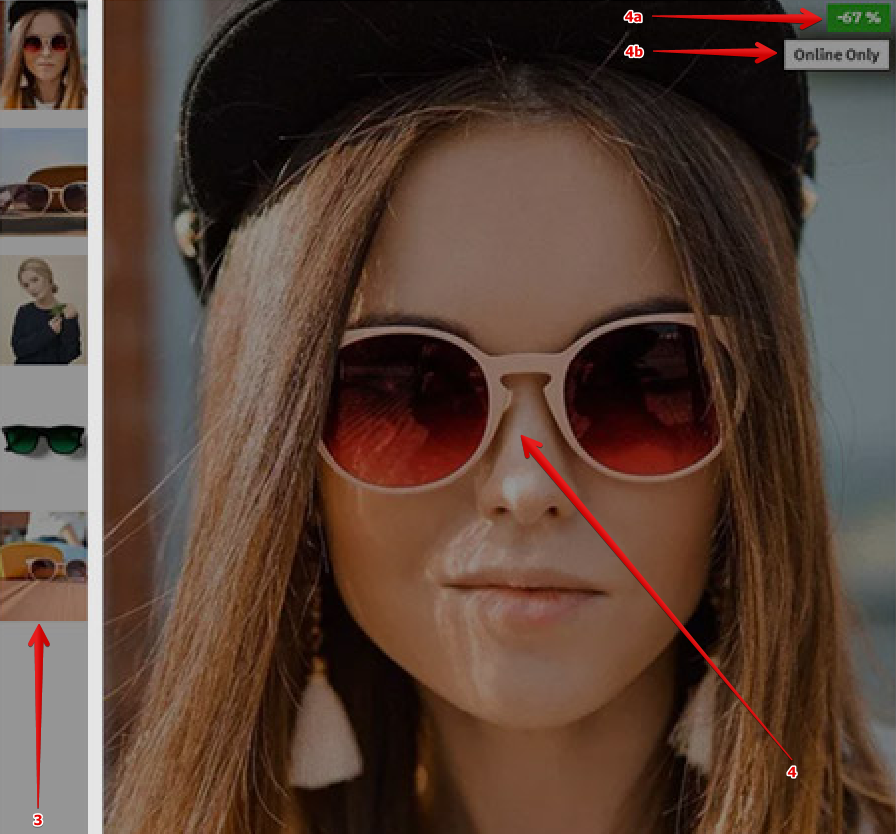
Additional Images and Product Image are used to visually describe the product itself while the Product Labels are used to advertise a certain status of the product (such as New, Hot, Sale%, Out Of Stock, Top Brand).
Storefront View
Admin View
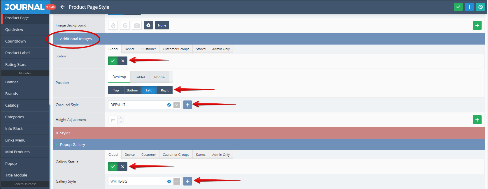
- Additional Images. These can be styled in Journal > Styles > Product Page > Product Image > Additional Images.... In the below picture you can see marked with red arrow some of the settings can be apply, such us the Status (the Visibility), Position, Carousel Style and also the Gallery Status and Style.
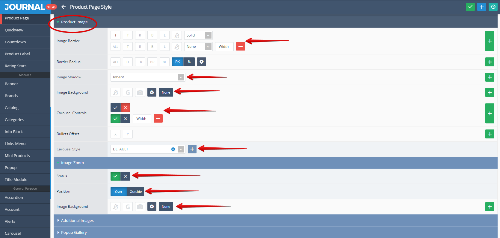
- Product Image. This can be styled in Journal > Styles > Product Page > Product Image....
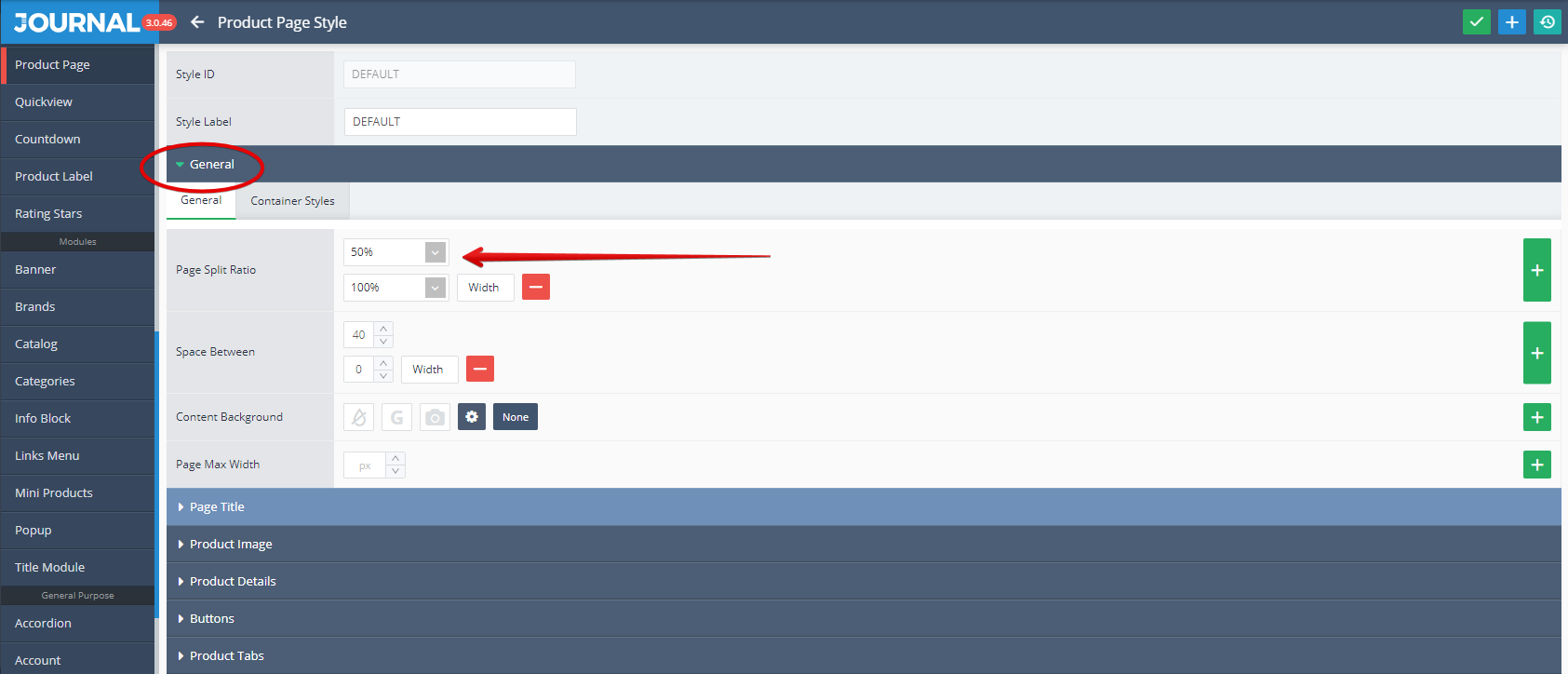
You can handle the main image container width from Journal > Styles > Product Page > [Active Style] > General > Page Split Ratio.
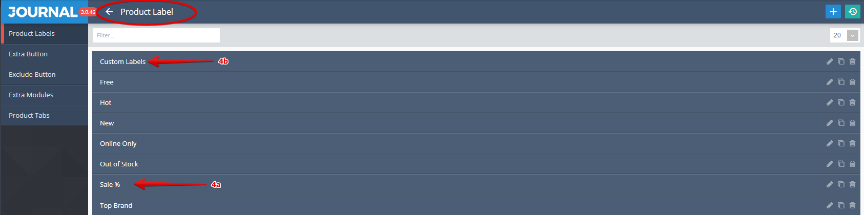
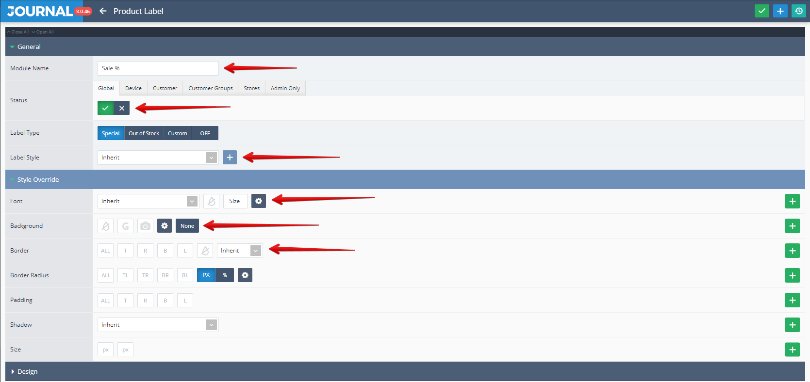
4a. Product Labels Sale %, created in Journal > Product Extras > Product Labels. Styles can be created in Journal > Styles > Product Label > ... and applied in each label module.
4b. Product Labels Custom Labels, created in Journal > Product Extras > Product Labels. Styles can be created in Journal > Styles > Product Label > ... and applied in each label module.
And for each Product Label the following settings are available (Status, Label Style, Font, Background, Border etc. )
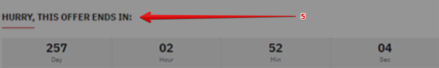
- Countdown is used to advertise that the offer for the selected product will expire in the displayed time interval.
Storefront View
Admin View
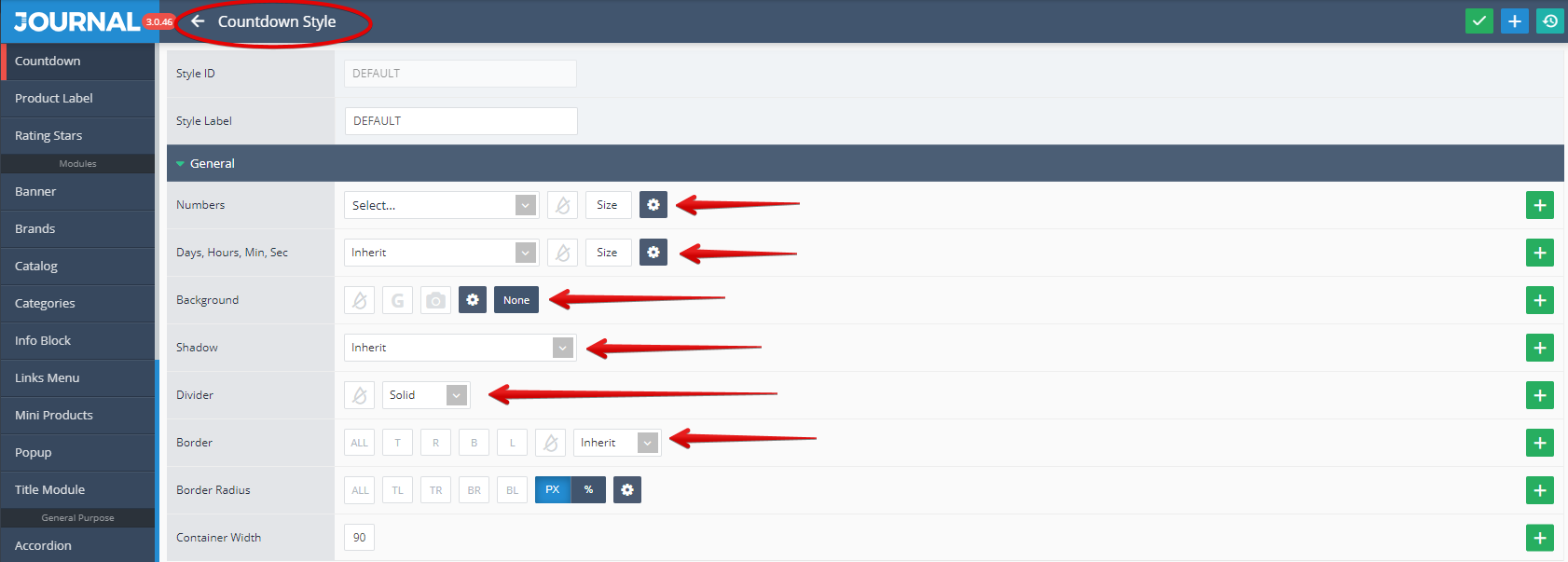
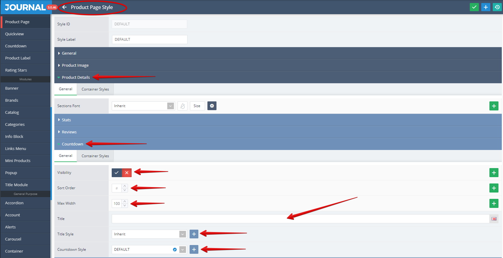
The Countdown style is created in Journal > Styles > Countdown > [Active Style] ... where settings like Numbers, Days, Hours, Minutes, Seconds, Background, Shadow, Divider, Border can be apply.
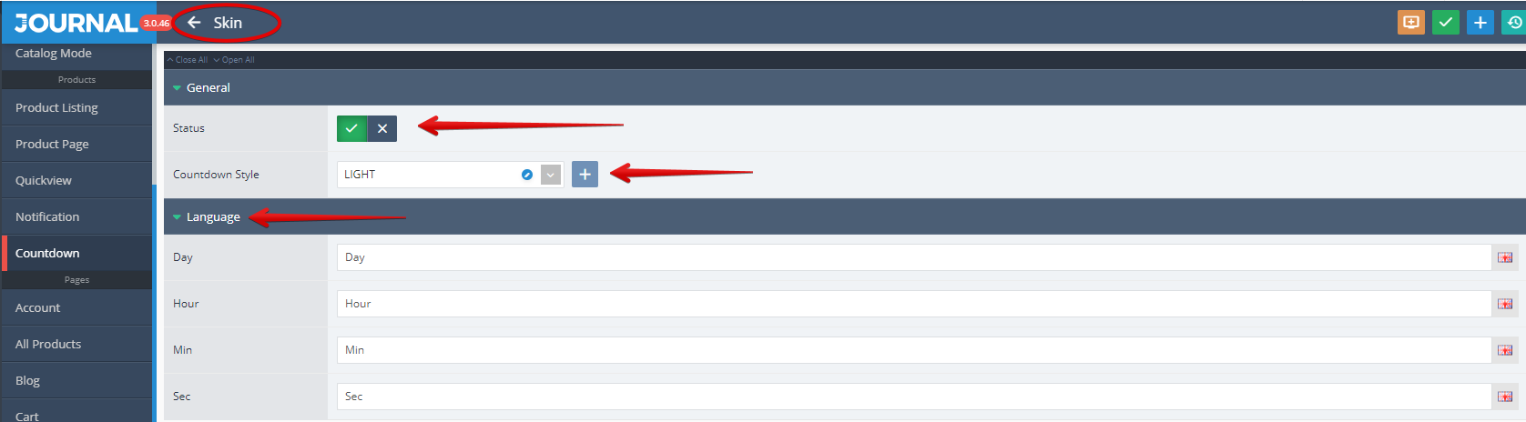
The Countdown style is added globally in Journal > Skins > Edit > Countdown >... where language styles are also set.
Additional settings for the product page countdown (such as Visibility, Sort Order, Max Width, Title, Title Style and Countdown Style) are available in Journal > Styles > Product Page > [Active Style] > Product Details > Countdown > Countdown Style....
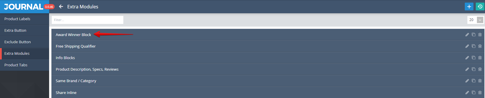
- Info Blocks Award Winner is used to display various information related to a product (in this example the name used for the Info Blocks was "Award Winner")
Storefront View

Admin View
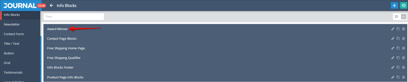
Info Blocks is created in Journal > Modules > Info Blocks. Additional settings are available after clicking on the desired item ("Award Winner" in this example).
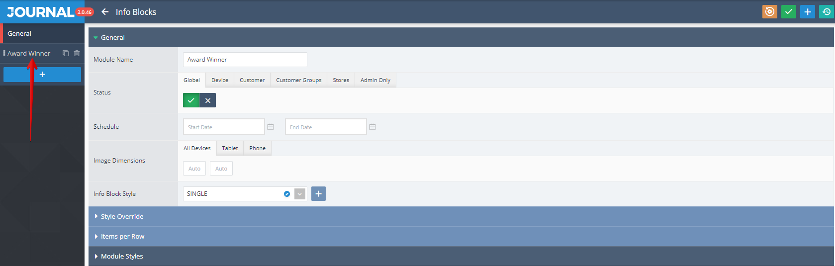
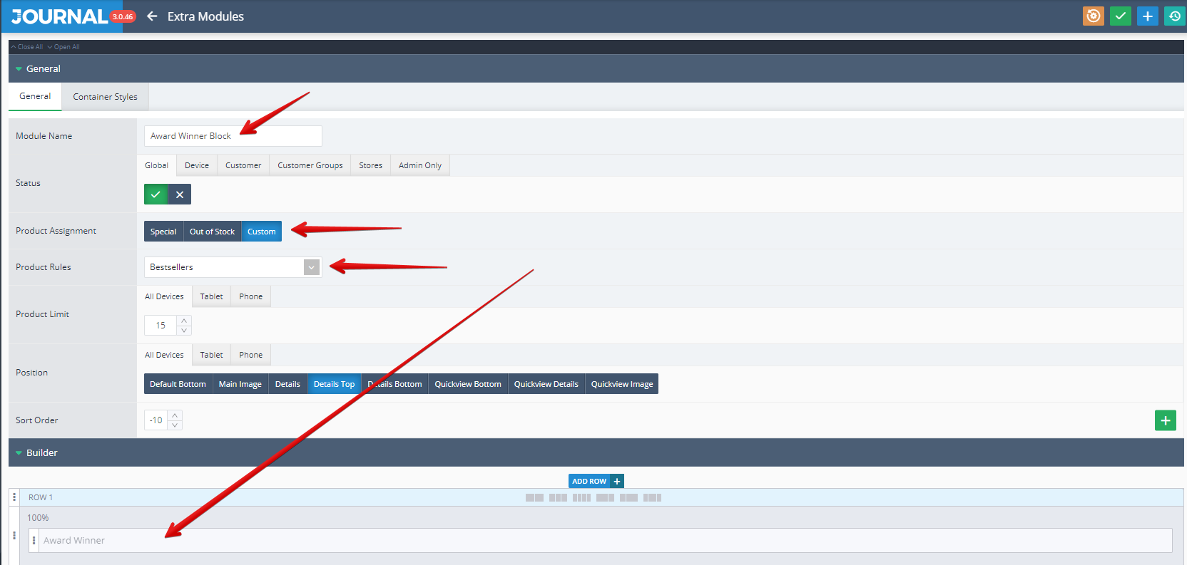
Info Blocks can be set up by using the options grouped under 2 tabs (General, Module Styles). By clicking once again on the desired item name from the top left side ("Award Winner" in our example, marked with a red arrow in the below picture),
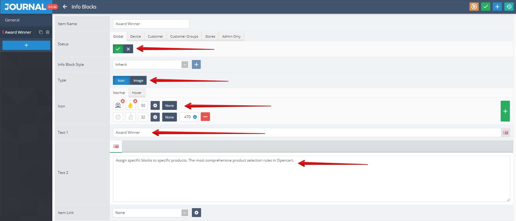
additional settings like Status, Type, Icon, Text1, Text2 can be apply.
Info Blocks is assigned in Journal > Product Extras > Extra Modules > [Active module] (Award Winner Block in this example)... .
The assignation is done via the Builder (in the Row1 in our example) as it shown in the below picture. In addition in the same window can be set up the Product Assignment and Product Rules.
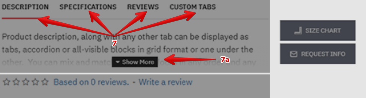
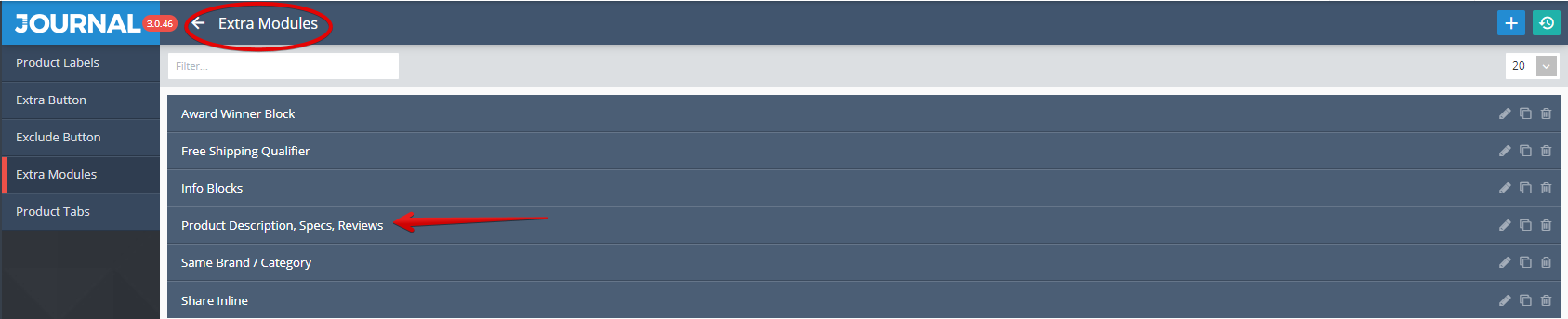
- Product Tabs modules allow the creation of default product tabs with pre-defined content such as Description, Specifications, Reviews, Videos. Besides the ones already mentioned can be define also Custom Tabs.
7a. Collapse Content is a feature which is often associated with the Product Tabs and allow to show initially a partial content of the current tab and after pushing the dedicated button called Show more to display the full content of the Product Tabs. Is very useful in the case where the available space is very limited (on tablet but mostly on mobile phone). See below an example.
Storefront View
Admin View
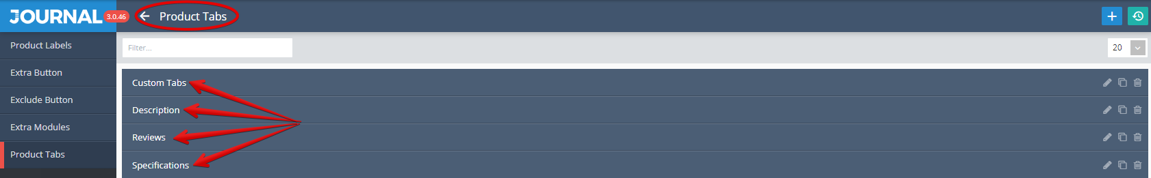
Product Tabs are created in Journal > Product Extras > Product Tabs.
By clicking on one specific product tab (in our below picture we selected Specifications tab) a new window is open with a lot of options available for customization.
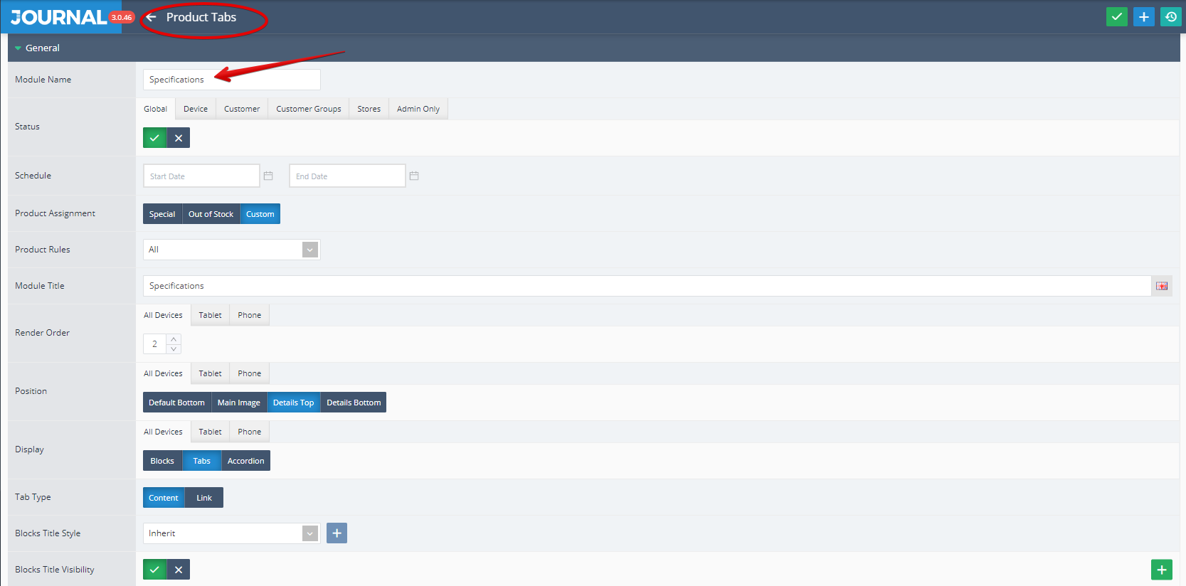
For a full description of Product Tabs, please read the documentation on Product Tabs.
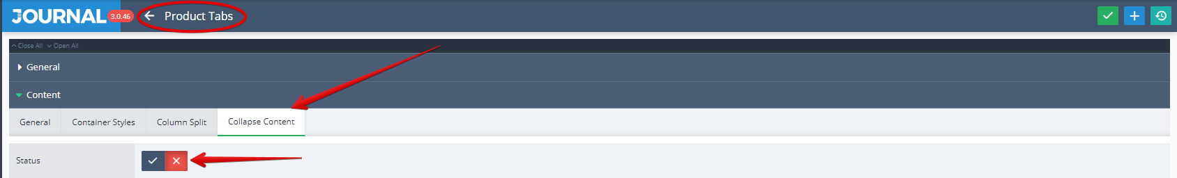
7a. Collapse Content can be controlled from the tab module in this case from Journal > Product Extras > Product Tabs > [Description] > Content > Collapse Content.
Admin View
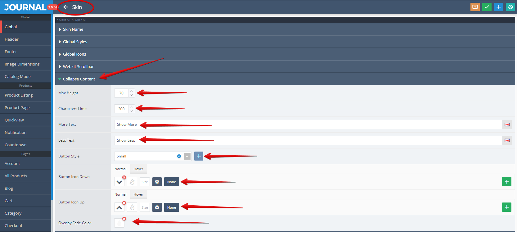
Additional global styles for this feature are found in Journal > Skins > Edit > Global > Collapse Content from where settings like Max Height, Character Limit, More Text, Less Text, Button Style, Button Icons (Up and Down) etc. can be apply.
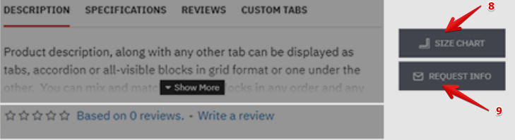
- Button Size Chart is a button created to be used in relation with products.
- Button Request Info is also a button created to be used in relation with products.
Storefront View
Admin View
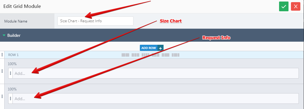
Both buttons were created in Journal > Modules > Button and assigned in Journal > Product Extras > Extra Modules > [Active module] (Description, Specs, Reviews + Size Chart in this example)... .
They were grouped in a grid defined in the Row1 (see Builder section.)
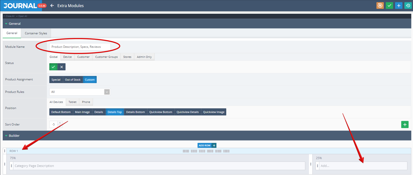
Inside the grid they were distributed in dedicated rows
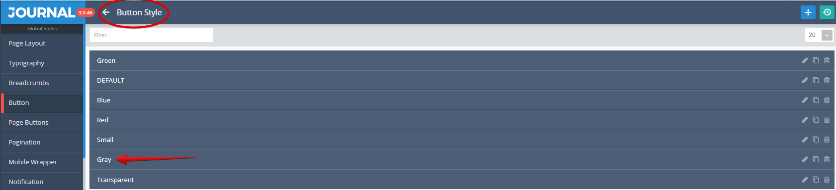
By clicking Edit on the first element from Row1 the options related to Size Chart button are available. Among the list of settings from the below picture please notice the style used by this button (Gray Style)
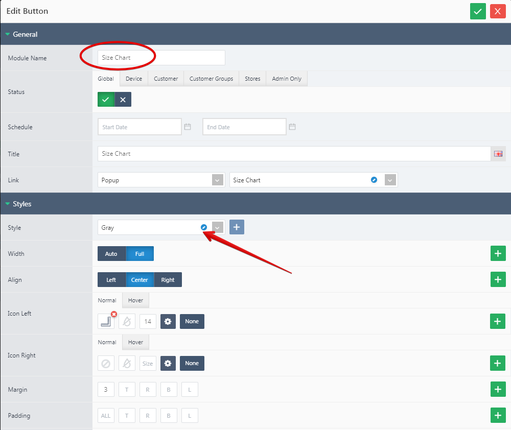
Both uses a Button style created in Journal > Styles > Button > ... (in our example Gray Style)
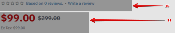
- Rating is an essential feature based on what the clients rate each products by using a stars based system.
- Price is also an essential feature for any products, especially for E-commerce platforms.
Storefront View
Admin View
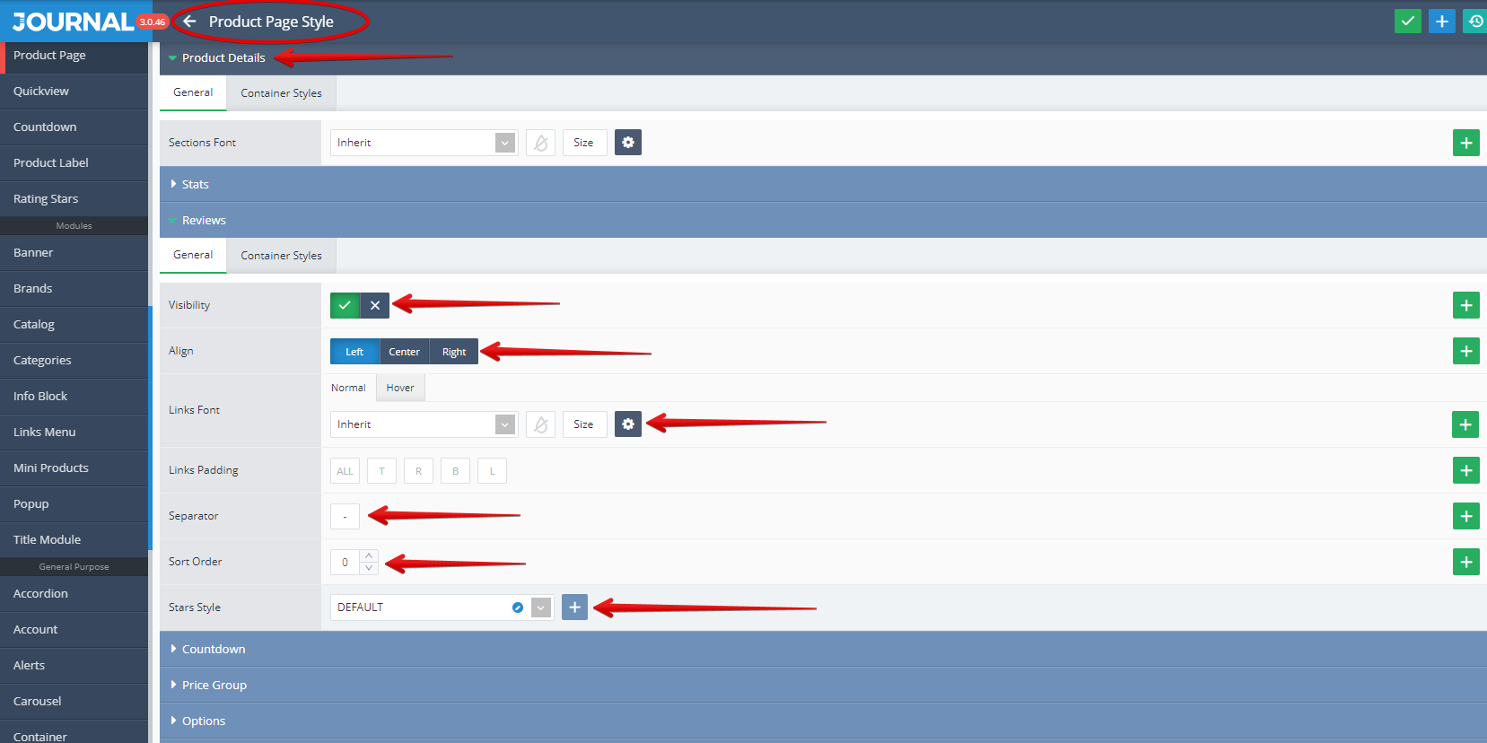
Rating can be styled in Journal > Styles > Product Page > [Active Style] > Product Details > Reviews.... From here settings like Visibility, Align, Links Font, Separator, Sort Order, Star Style can be apply.
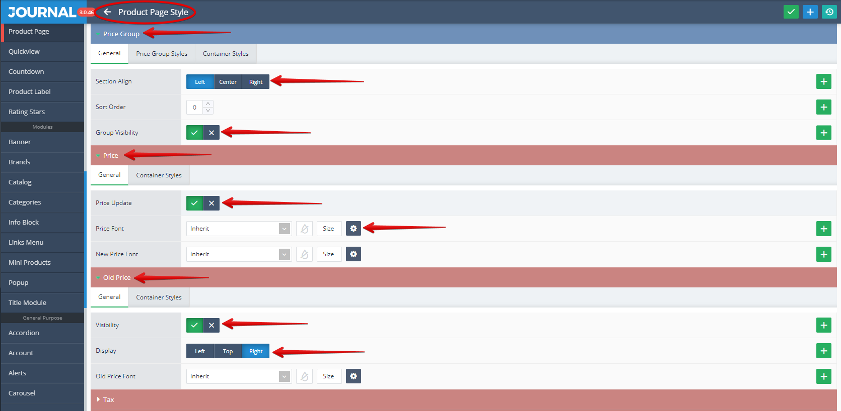
Price. These can be styled in Journal > Styles > Product Page > [Active Style] > Product Details > Price Group.... From here settings like Price Group Visibility, Align, Sort Order, Price and Old Price Visibility and Fonts can be apply.
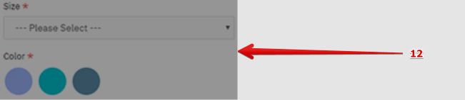
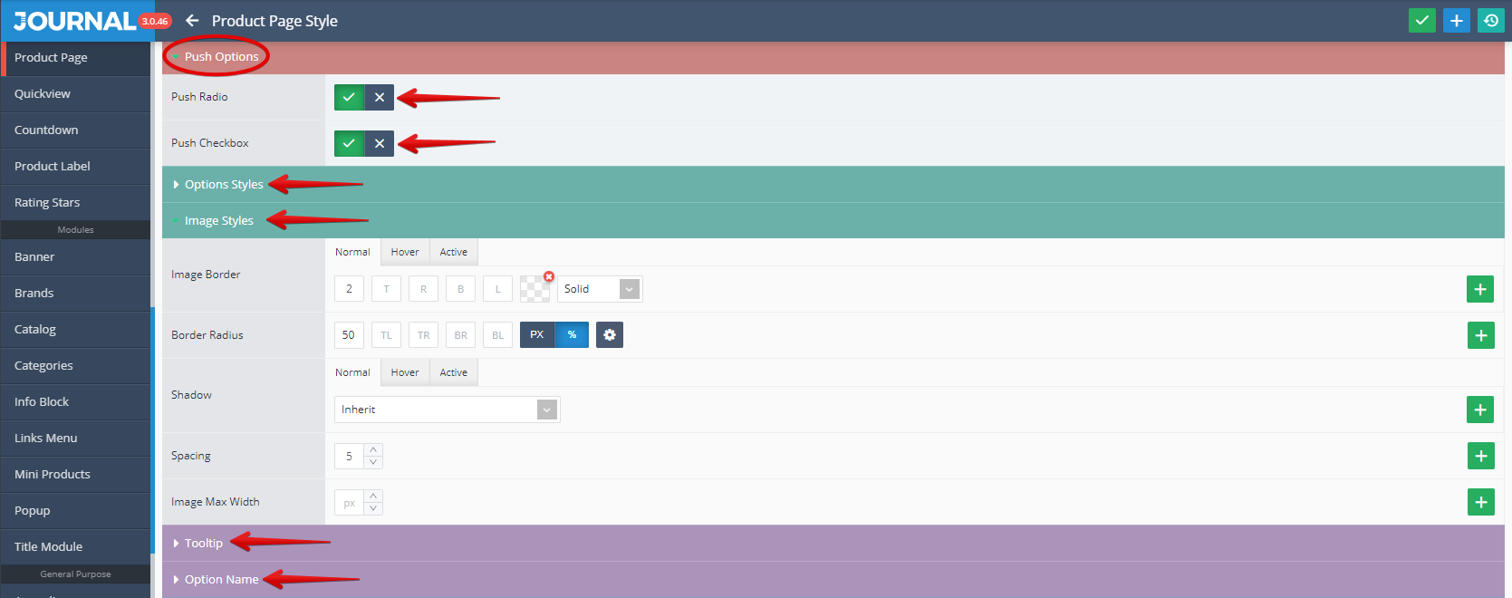
- Options are product characteristics such as Size, Colour, Delivery date. See below an example of product Options.
Storefront View
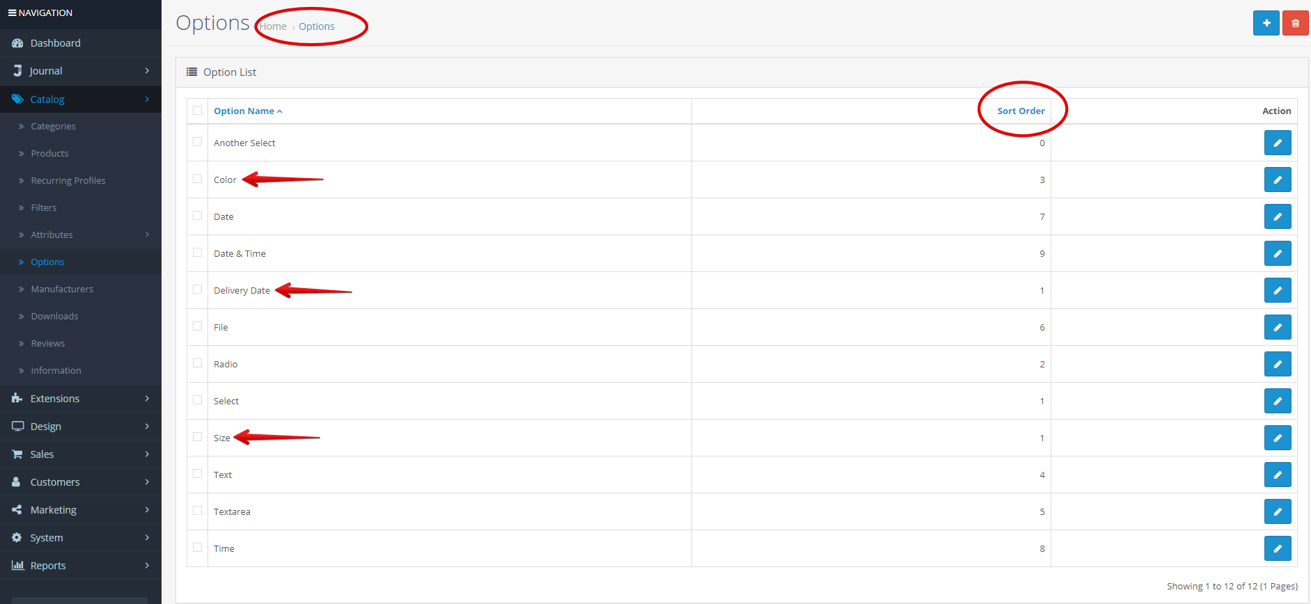
Admin View
Options are created in Opencart > Catalog > Options. See in the below picture marked with red arrows the Size, Colour and Delivery Date as examples. Please notice the Sort Order which allow the set up of the priority of each option in the sorting process.
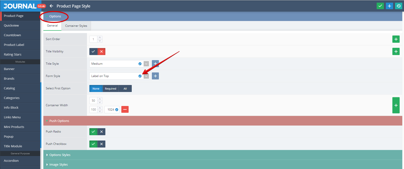
These can be styled in Journal > Styles > Product Page > [Active Style] > Product Details > Options where a Form style (in our example the Form name is "Label on Top") can be used to style the inputs.
After clicking on the edit button from Form Style field, a dedicated window is open where settings for Labels, Required Fields, Inputs (Style, Text Area, Select), Radio, Checkbox, Button Group, Legend, Date Time and Upload File can be apply.
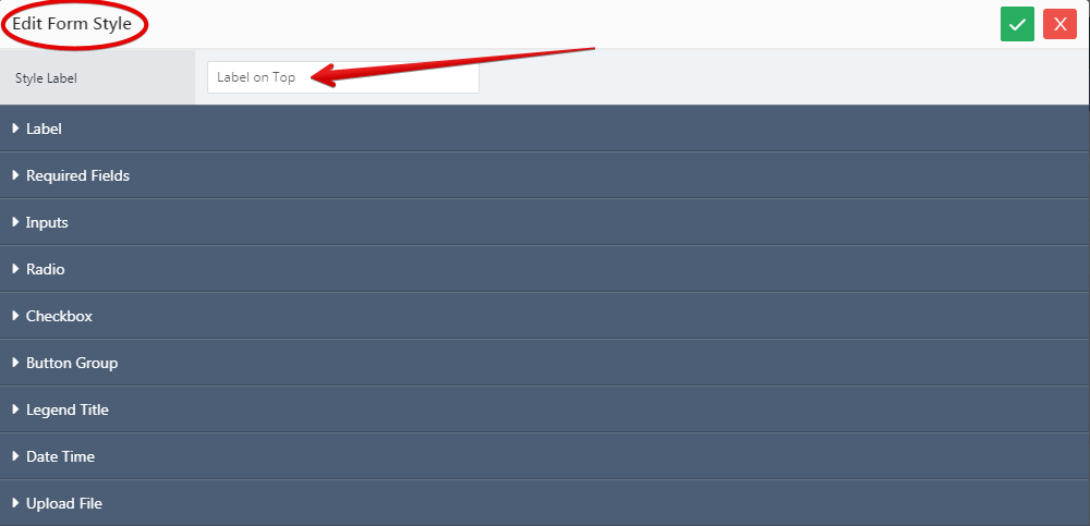
Additional customizable options are in the Push Options sub-section of the same page.
- Quantity is used to allow the user to set up the quantity who want to purchase for a certain product. This can be done directly by enter the desired number or by using the Up and Down arrow keys.
Storefront View
Admin View
Quantity is styled in Journal > Styles > Product Page > [Active Style] > Buttons > Quantity.
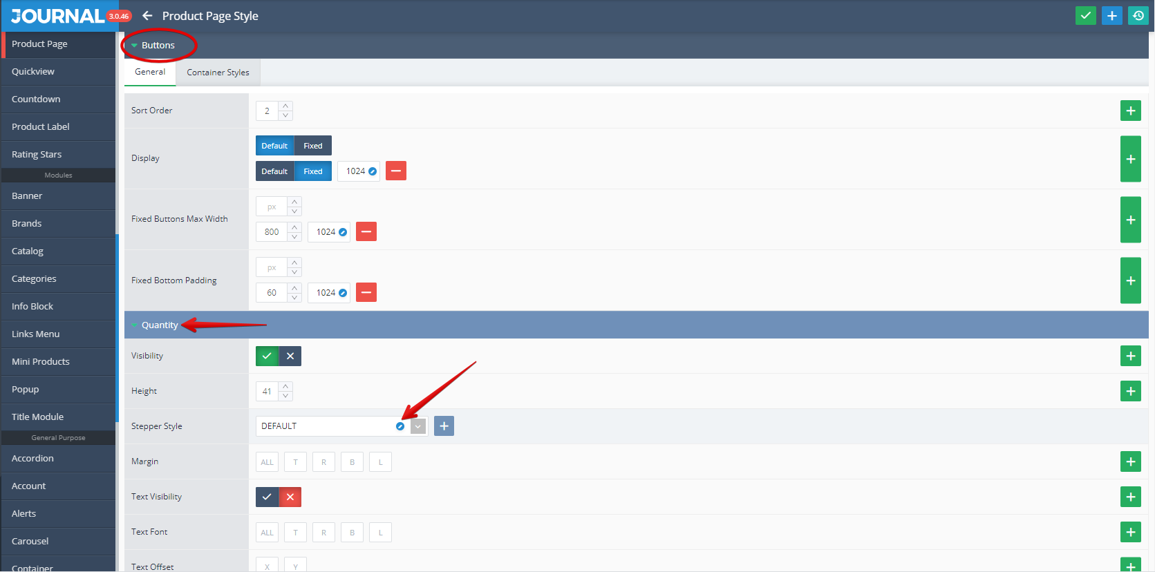
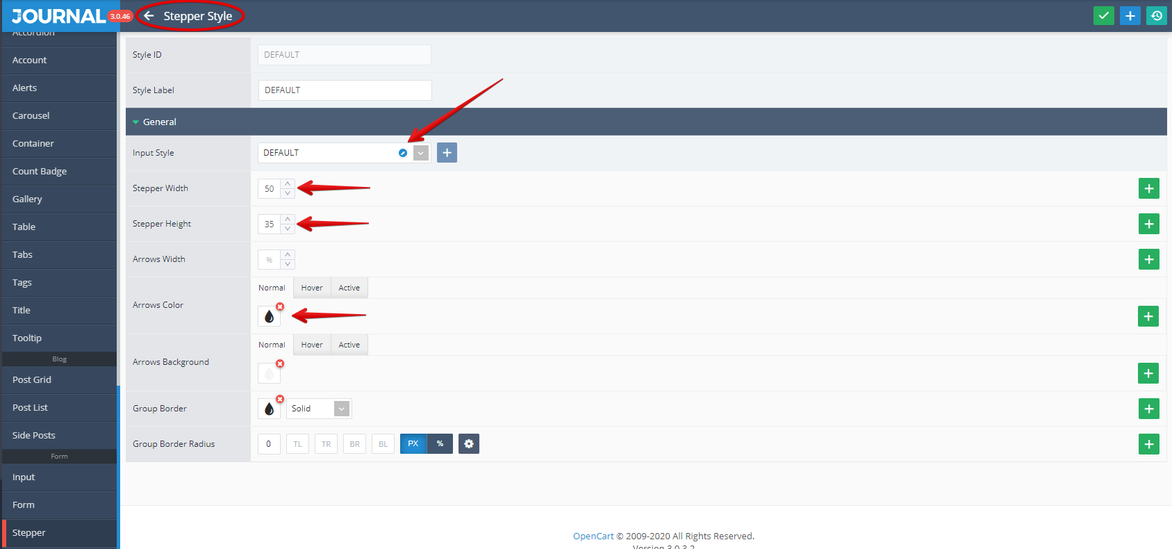
This uses a Stepper style created in Journal > Styles > Stepper > ... from which settings on Input Style, Stepper Width and Height , Arrows Color can be apply.
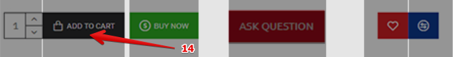
- Add to Cart is a standard Opencart button used for add the desired product(s) to your shopping cart.
Storefront View
Admin View
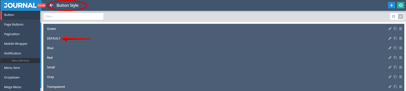
The button is styled in Journal > Styles > Product Page > [Active Style] > Buttons > Add to Cart.... In our example this button is set up with Visibility ON and use as Button Style the DEFAULT scheme.
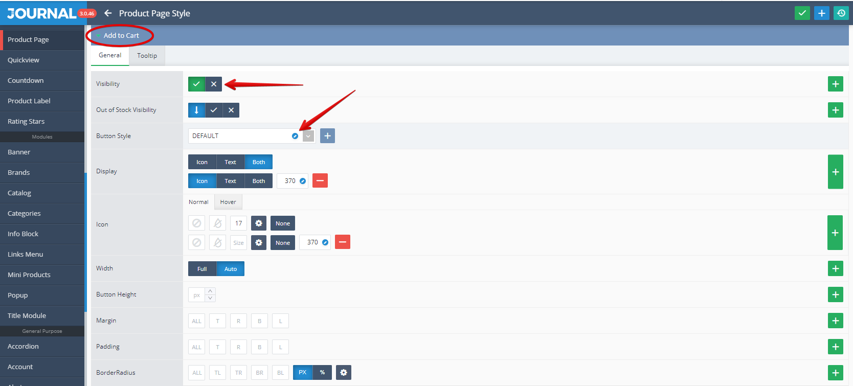
This uses style created in Journal > Styles > Button > ...
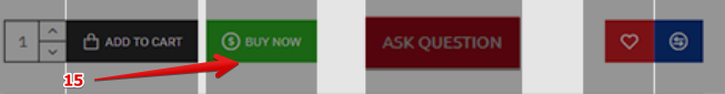
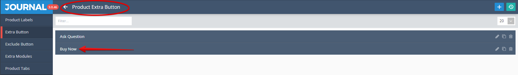
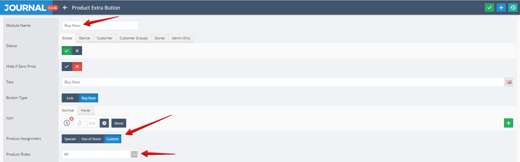
- Buy Now is an extra button specific to Journal theme. This button will automatically add the product to cart and proceed to checkout (2 operations with only one click).
Storefront View
Admin View
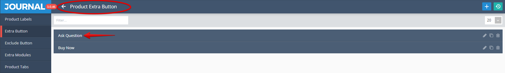
This button is created in Journal > Product Extras > Extra Button.
To this button can be apply some specific settings including The Product Assignment and Product rules.
This can be styled in Journal > Styles > Product Page > Buttons > Extra Button....
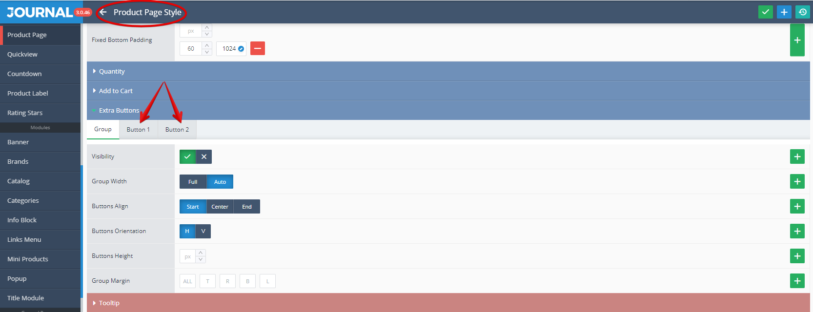
The specific element for each Extra button can be found after clicking on Button1 or Button2. In our example Buy Now is Button1 (see the Button 1 Style defined as "Green").
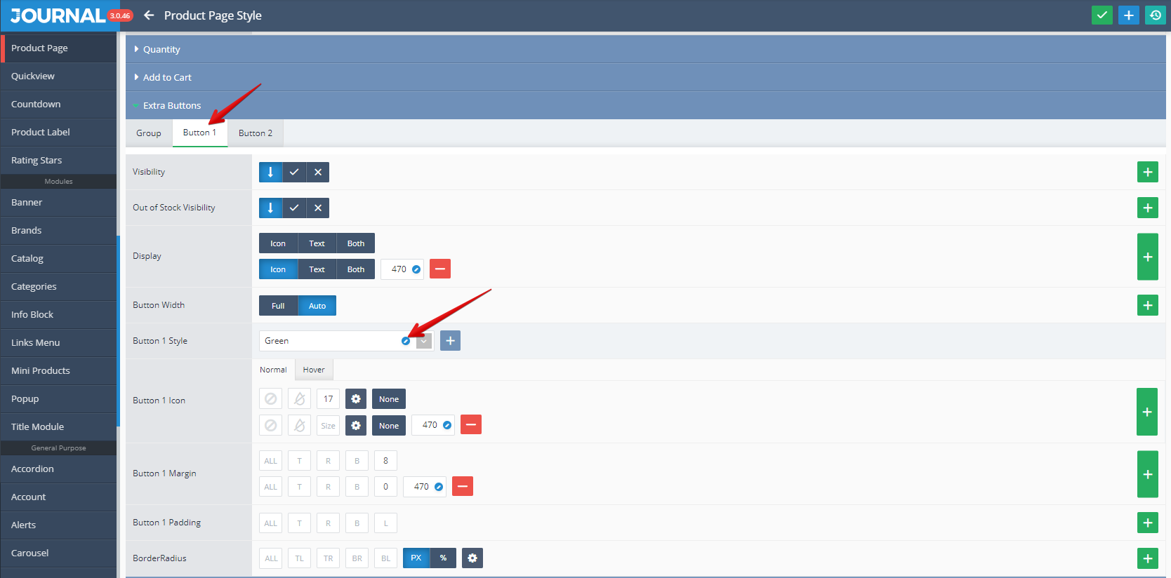
It uses a Button style created in Journal > Styles > Button > ....
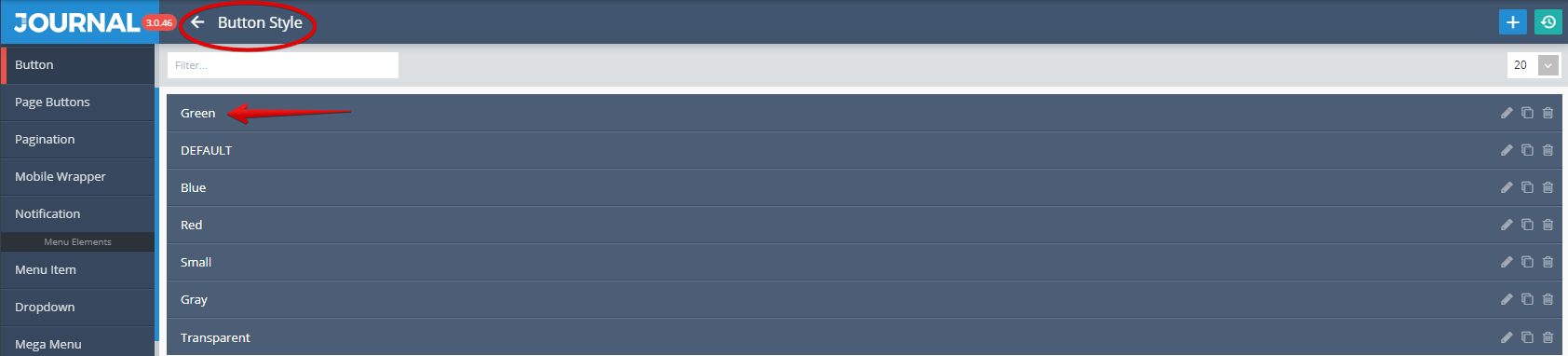
For more info on how the Extra Buttons work please see the documentation on the Extra Buttons. Also check out the Product Assignment docs to understand the concept of how these are assigned to various products.
- Ask Question is an extra button specific to Journal theme. This button acts as a normal button which can point to any link (for opening Popups such as one with a contact form or any other popups).
Storefront View
Admin View
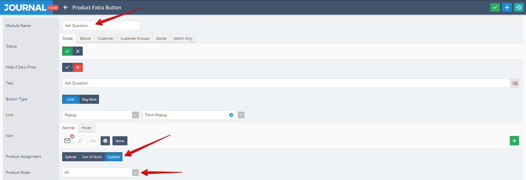
This button is created in Journal > Product Extras > Extra Button.
To this button can be apply some specific settings including The Product Assignment and Product rules.
This can be styled in Journal > Styles > Product Page > Buttons > Extra Button...

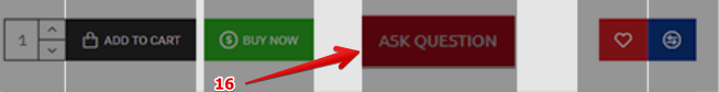
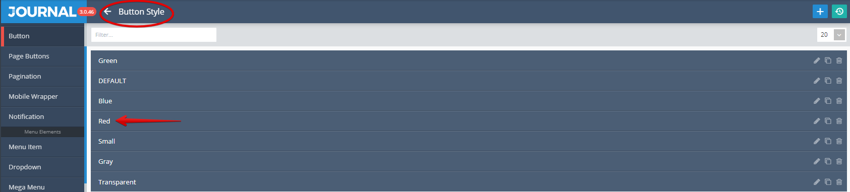
The specific element for each Extra button can be found after clicking on Button1 or Button2. In our example Ask Question is Button2 (see the Button 2 Style defined as "Red").
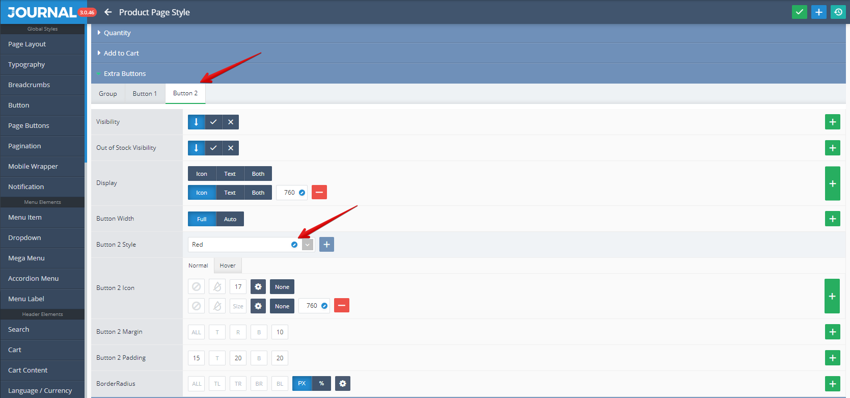
It uses a Button style created in Journal > Styles > Button > .... .
For more info on how the Extra Buttons work please see the documentation on the Extra Buttons. Also check out the Product Assignment docs to understand the concept of how these are assigned to various products.
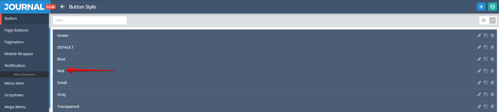
- Wishlist is a standard Opencart button used for add the desired product(s) to your Whishlist.
Storefront View
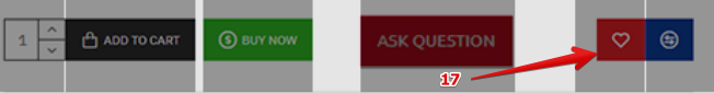
Admin View
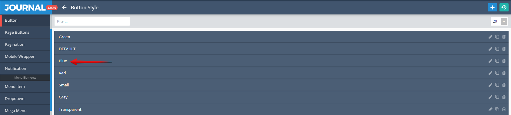
This is styled in Journal > Styles > Product Page > [Active Style] > Buttons > Wishlist / Compare > Wishlist.... In our example this button used the Red Button Style .
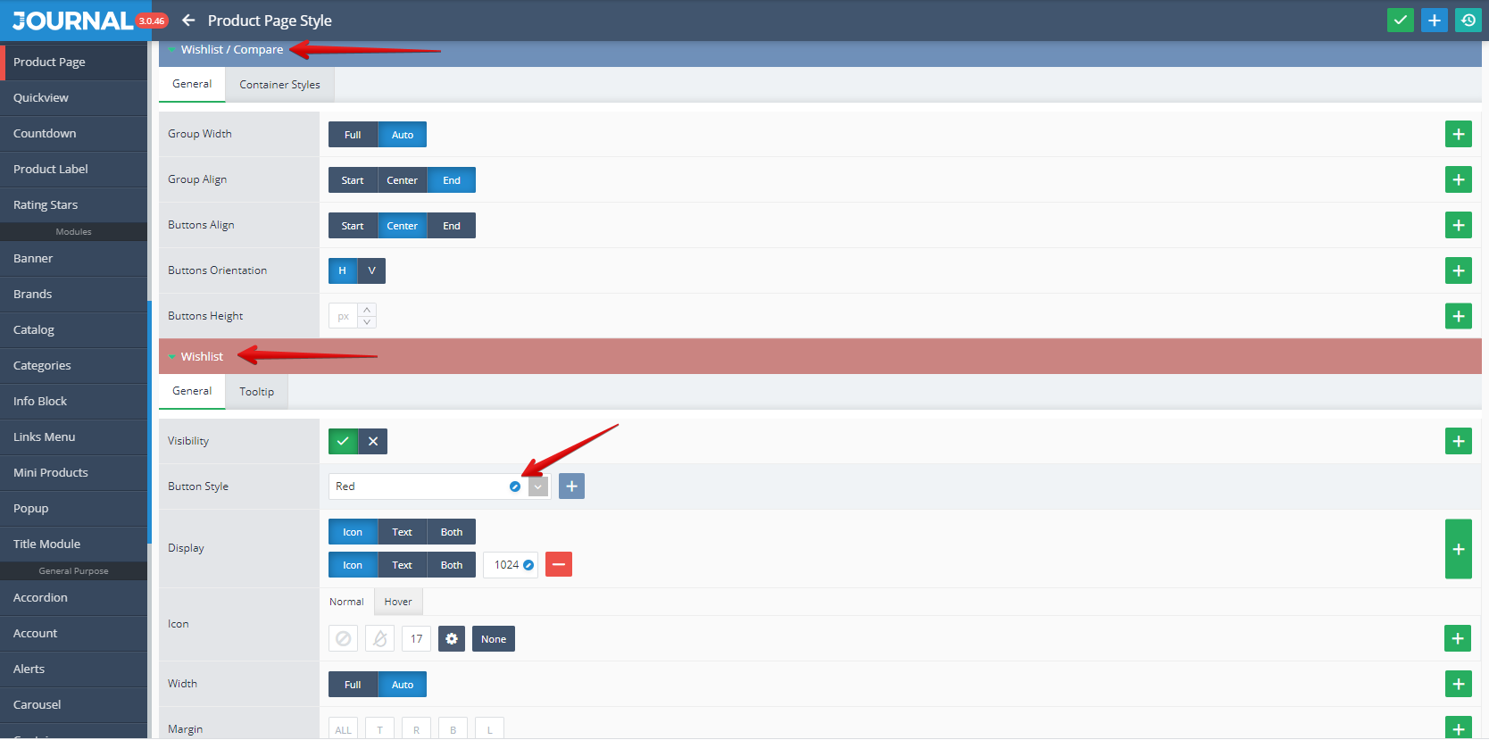
This uses Button style created in Journal > Styles > Button > ... (Red in our example)
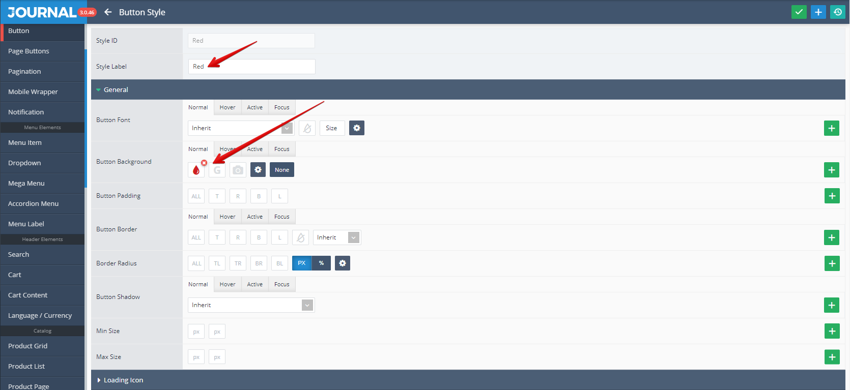
This Red Button Style has the following detailed characteristics (Label and Background were marked with red arrows)
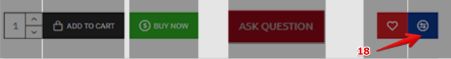
- Compare is a standard Opencart button used for add the desired product(s) to your Compare list.
Storefront View
Admin View
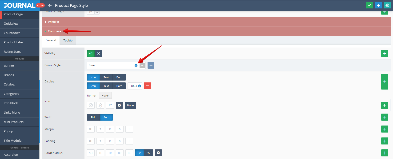
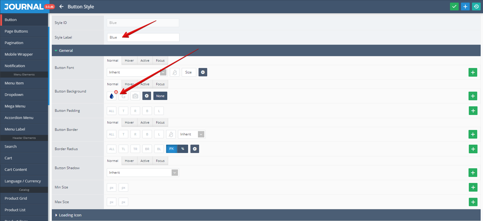
This is styled in Journal > Styles > Product Page > [Active Style] > Buttons > Wishlist / Compare > Compare.... In our example this button used the Blue Button Style .
This uses Button style created in Journal > Styles > Button > ... (Blue in our example)
This Blue Button Style has the following detailed characteristics (Label and Background were marked with red arrows)
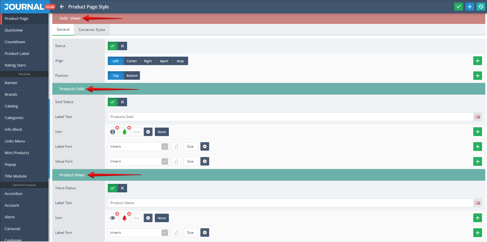
- Sold - Views enter in the Product Stats category. Is is used to store and display quantitative figures related to the selected product: Sold pieces and Viewed pieces.
Storefront View

Admin View
These can be styled in Journal > Styles > Product Page > [Active Style] > Product Details > Stats > Sold - Views...
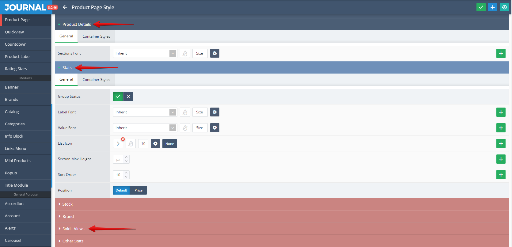
Detailed settings (Status, Align, Position, Sold Status and View Status and Label text, Icon, Label Font, Value Font for both Sold And View categories) can be found in the below picture.
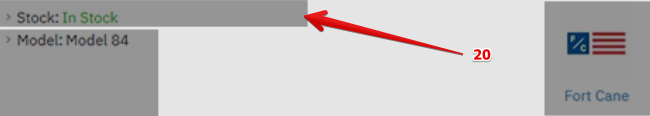
- Stock is an Opencart standard feature used for store and display the stock information for the selected product. Possible values are: In Stock or Out of Stock.
Storefront View
Admin View
This can be styled in Journal > Styles > Product Page > [Active Style] > Product Details > Stats > Stock...
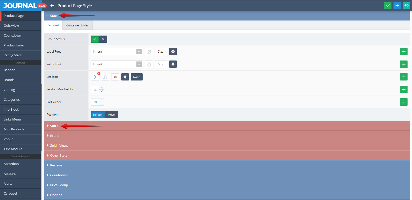
Detailed settings (Status, Text, In Stock Text, Label Visibility, In Stock Font, Out of Stock Font, In Stock Icon, Out of Stock Icon) can be found in the below picture.
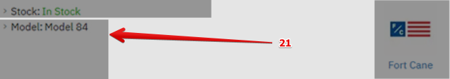
- Model is an Opencart standard feature used for store and display the model of the selected product.
Storefront View
Admin View
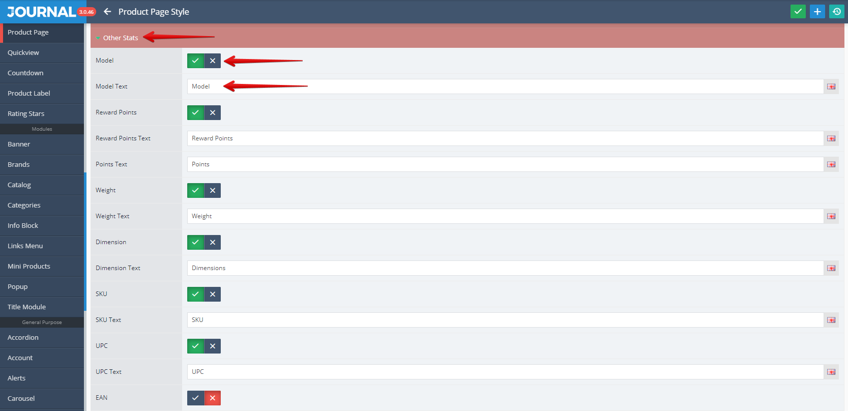
This can be styled in Journal > Styles > Product Page > [Active Style] > Product Details > Stats > Other Stats...
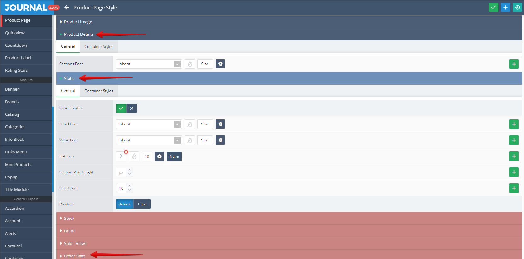
Detailed settings related to the Model (Visibility and Model Text), together with a lot of Other Stats like Reward Points, Weight, Dimension, Location etc. can be found in the below picture.
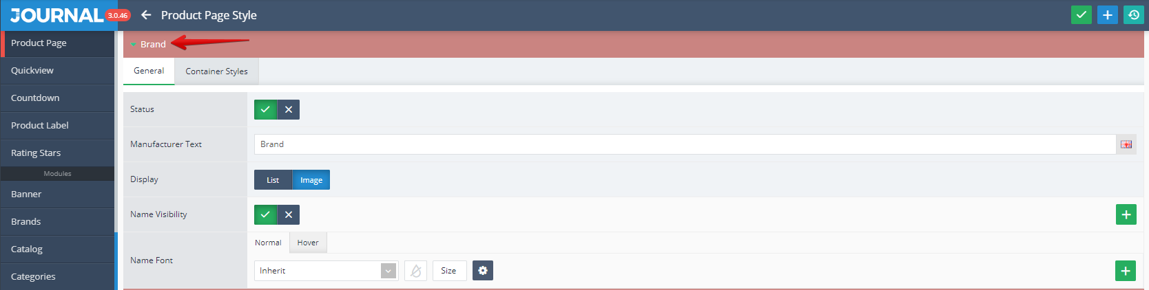
- Brand is an Opencart standard feature used for store and display the brand of the selected product.
Storefront View
Admin View
This can be styled in Journal > Styles > Product Page > [Active Style] > Product Details > Stats > Brand...
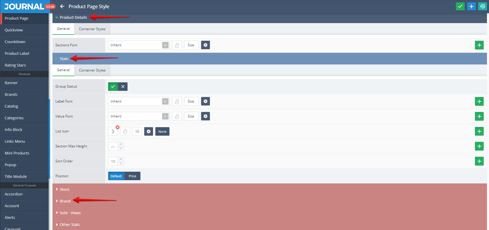
Detailed settings (Status, Manufacturer Text, Display, Name Visibility, Name Font) can be found in the below picture.
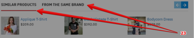
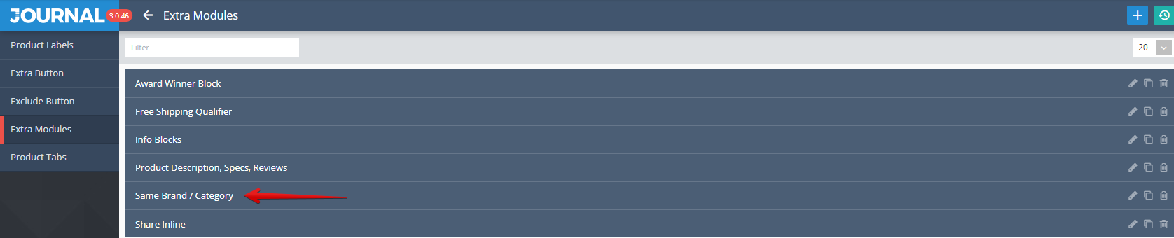
- Mini Products Same Brand / Category allow to display products from the same Brand or Category as the selected product.
Storefront View
Admin View
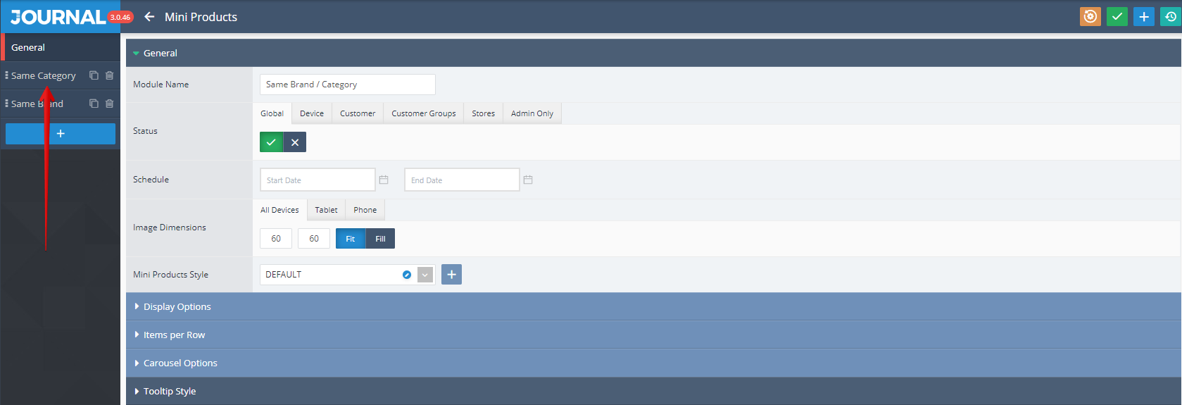
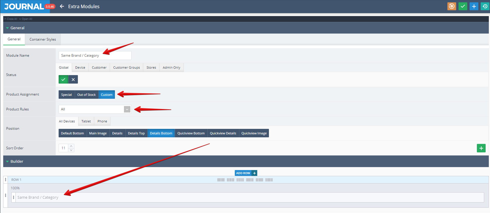
Mini Products are created in Journal > Modules > Mini Products. Additional settings are available after clicking on the desired item ("Same Brand / Category" in this case).

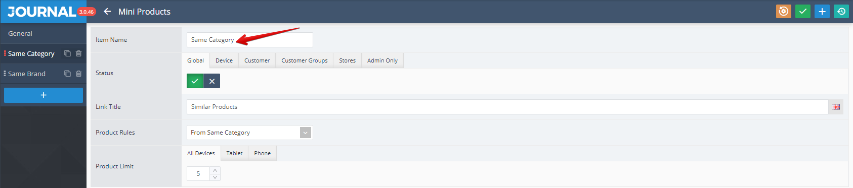
Detailed settings grouped in 2 tabs (General and Tooltip Style) can be found in the below picture. By clicking once again on the desired item name from the top left side called in this example "Same Category" (the one marked with a red arrow),
Each of these 2 Mini Products group (Same Brand, Same Category) can be set up by using the following options (Item Name, Status, Link Title, Product Rules, Product Limit)
Assigned in Journal > Product Extras > Extra Modules > [Active module] ... .
The assignation is done via the Builder (in the Row1 in our example) as it shown in the below picture. In addition in the same window can be set up the Product Assignment and Product Rules.
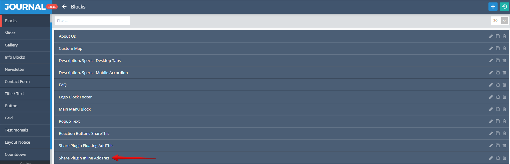
- Blocks Share Plugin Inline AddThis is used in this case for allowing the access to a various social networks / communication channels via dedicated icons.
Storefront View
Admin View
Blocks are created in Journal > Modules > Blocks... . Additional settings are available after clicking on the desired item ("Share Plugin Inline AddThis" in this case).
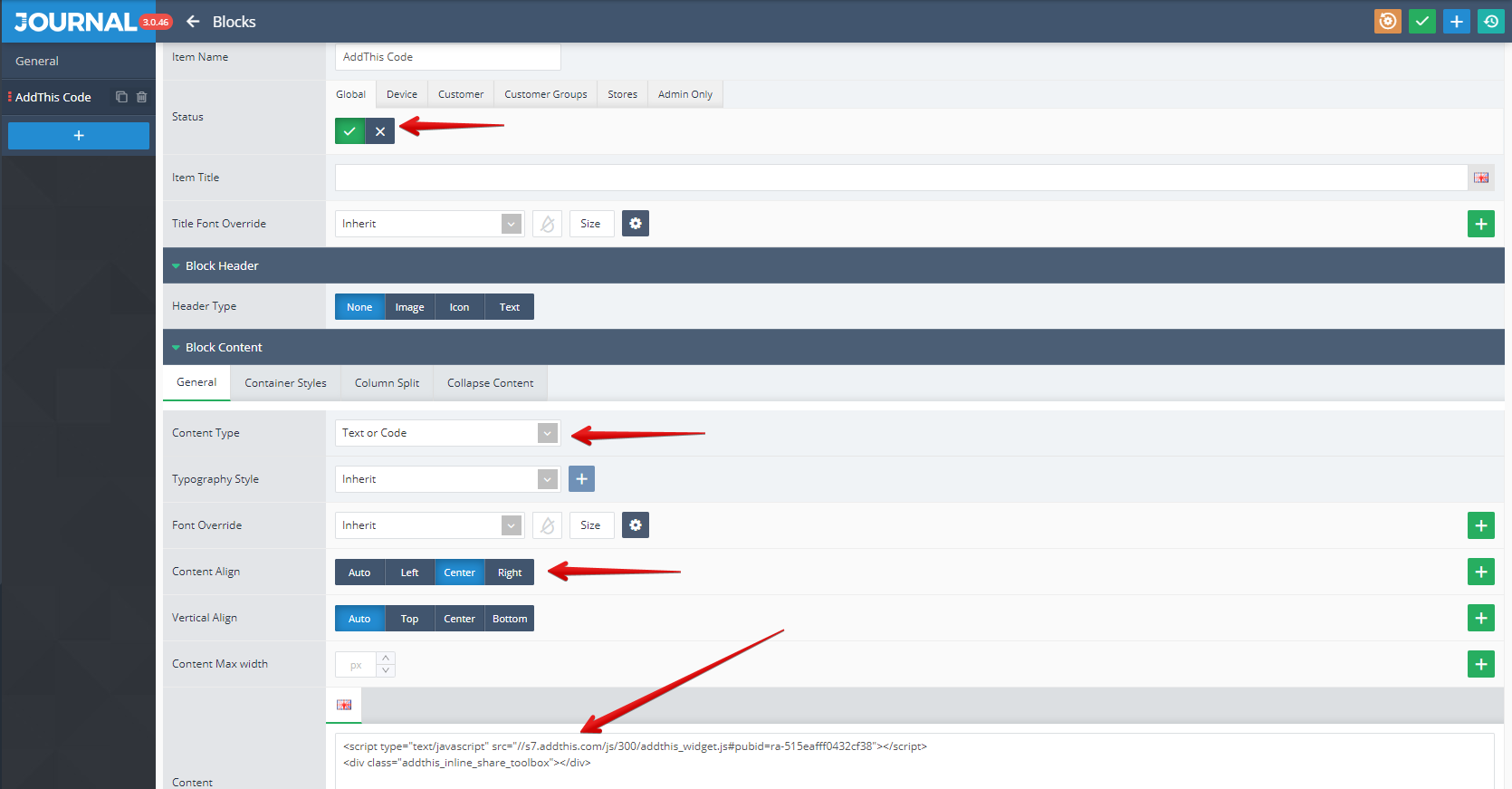
Detailed settings grouped under 2 tabs (General and Block Styles) can be found in the below picture. By clicking once again on the desired item name from the top left side called in this example "AddThisCode" (the one marked with a red arrow),
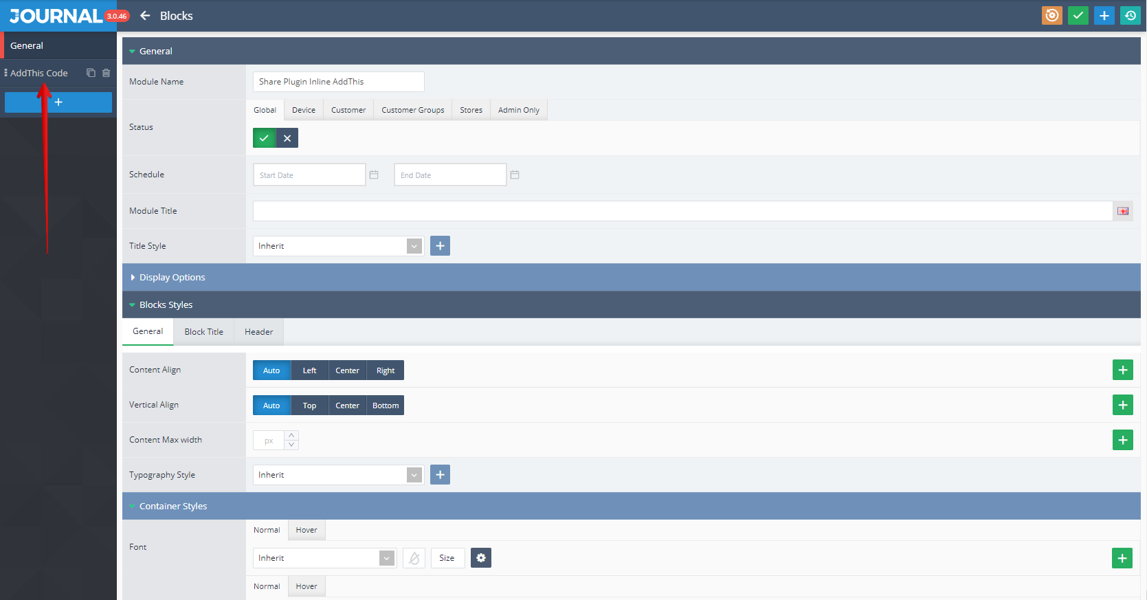
additional settings grouped under 3 tabs (General, Block Header, Block Content) can be apply. We only mention settings like Status, Content Type, Content Align, Content (in which JavaScript code can be added).
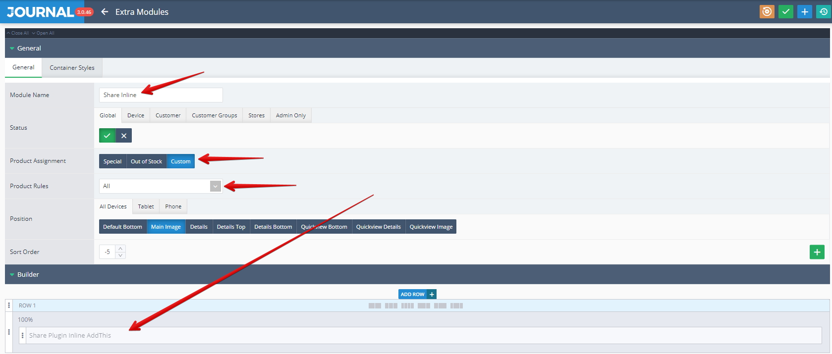
Blocks is assigned in Journal > Product Extras > Extra Modules > [Active module] (ShareInline in this example)... , in the Row1 (via the Builder). In addition in the same window can be set up the Product Assignment and Product Rules.
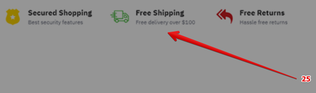
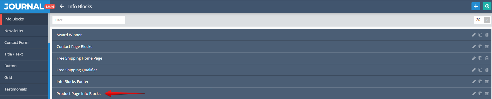
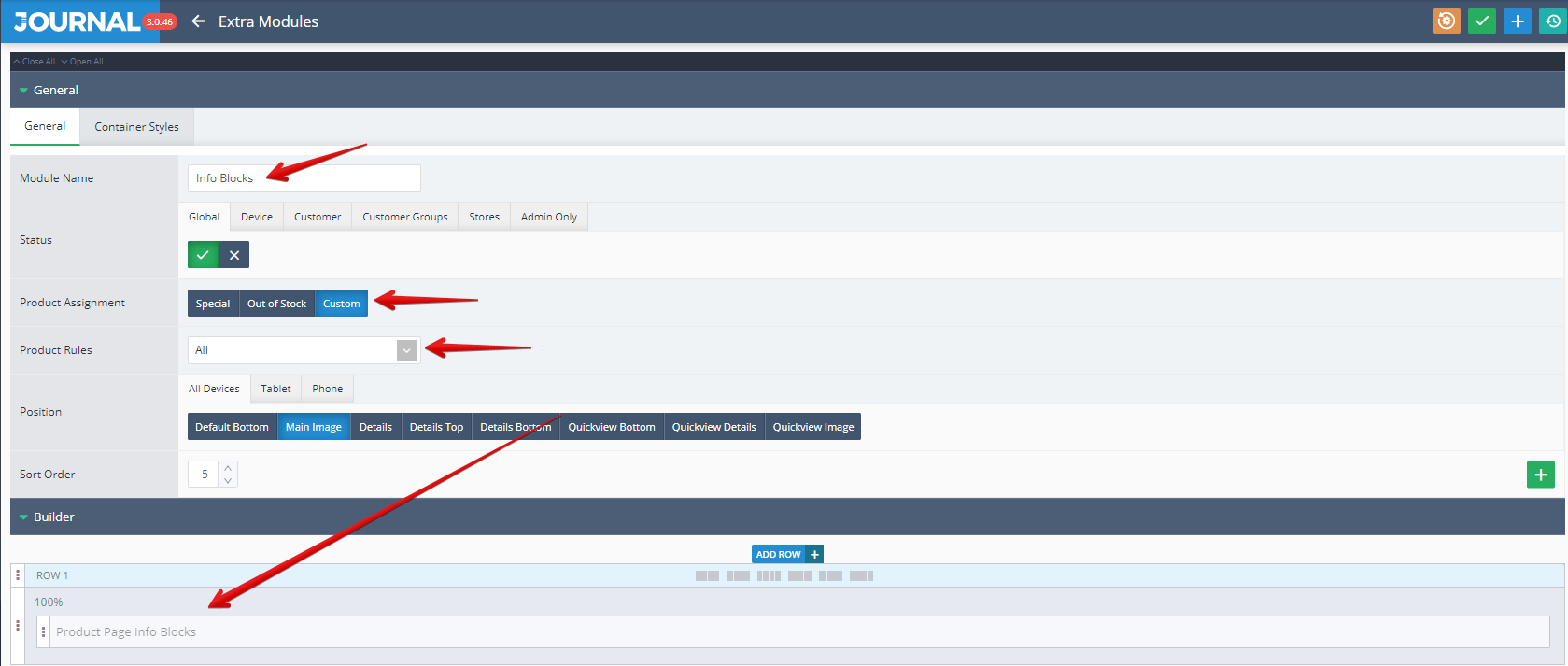
- Info Blocks Product Page Info Blocks is used to display various information related to a product (in this example the name used was "Product Page Info Blocks").
Storefront View
Admin View
Info Blocks is created in Journal > Modules > Info Blocks. Additional settings are available after clicking on the desired item ("Product Page Info Blocks" in this example).
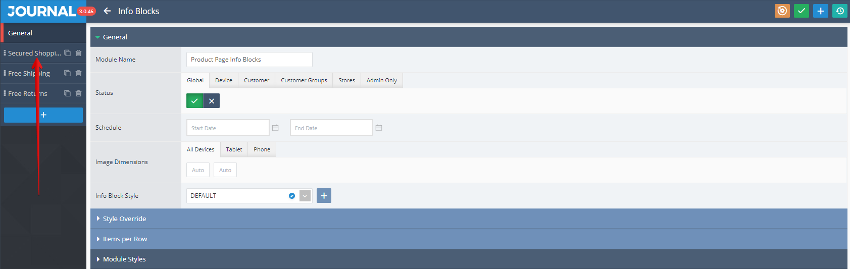
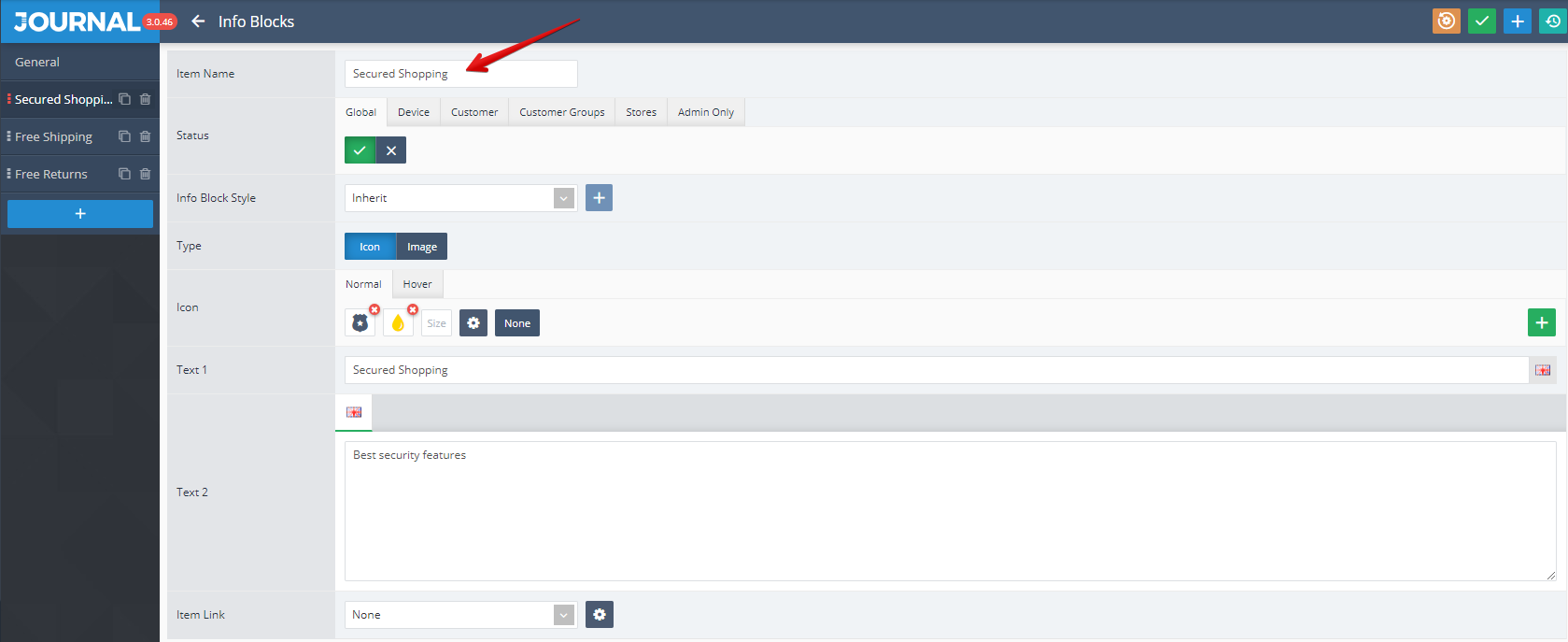
Info Blocks can be set up by using the options grouped under 2 tabs (General, Module Styles). By clicking once again on the desired item name from the top left side ("Secured Shopping" in our example, marked with a red arrow in the below picture),
additional settings like Status, Info Block Style, Type, Icon, Text1, Text2, Item Link can be apply.
Info Blocks is assigned in Journal > Product Extras > Extra Modules > [Active module] (Info Blocks in this example)... .
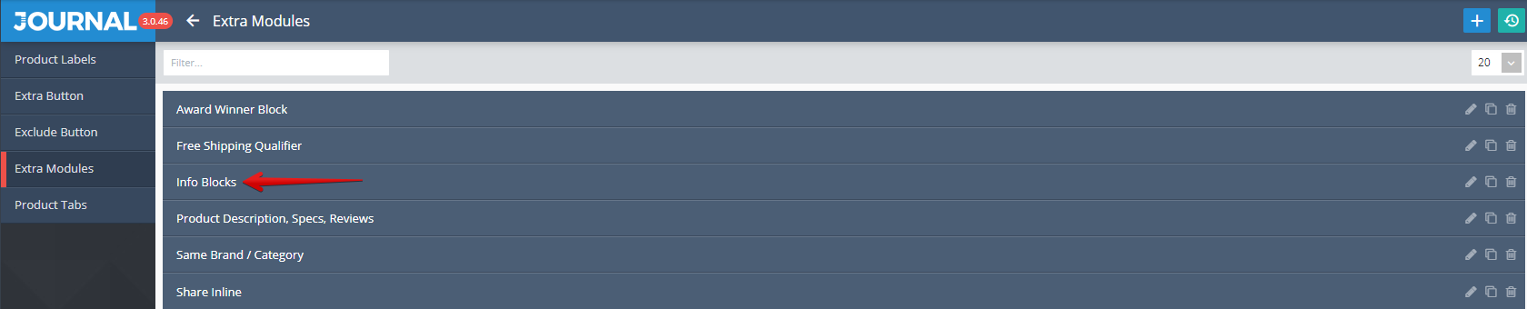
The assignation is done via the Builder (in the Row1 in our example) as it shown in the below picture. In addition in the same window can be set up the Product Assignment and Product Rules.
- Tags is an Opencart standard feature used for store and display certain products groups (categories) in which the selected product fits.
Storefront View
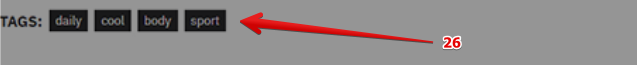
Admin View
Tags is styled in Journal > Styles > Product Page > Product Details > Tags...
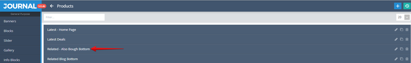
- Products Related - Also Bough Bottom allow to display related products with the one which you currently selected, but also other products chosen by persons who bought the selected product. Please notice that "Related - Also Bough Bottom" is a name used in this example.
Storefront View
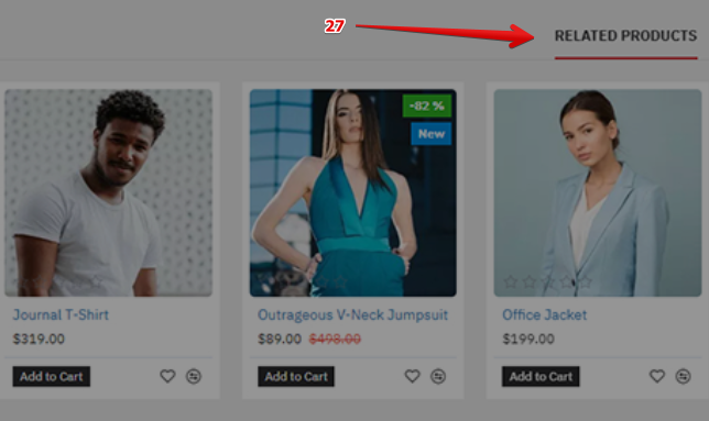
Admin View
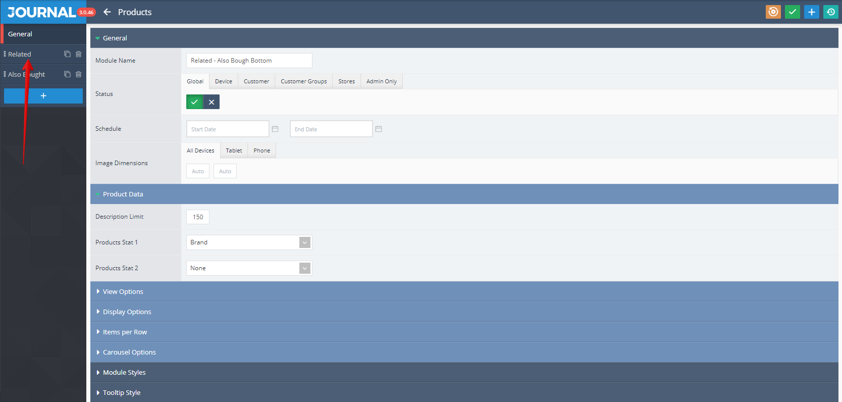
Products is created in Journal > Modules > Products. Additional settings are available after clicking on the desired product item ("Related - Also Bough Bottom" in this example).
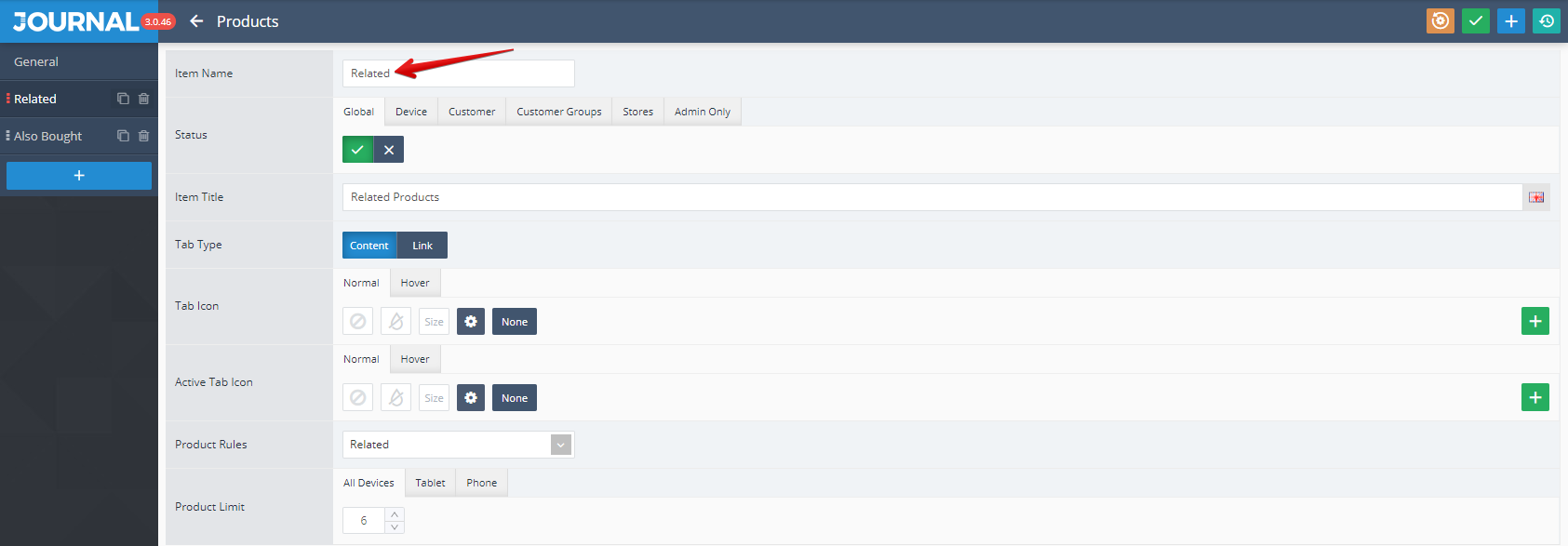
The additional settings are grouped under 3 tabs: General, Module Styles, Tooltip Styles. By clicking once again on the desired item name from the top left side ("Related" in this example, marked with a red arrow in the below picture),
specific settings like Status, Item Title, Tab Type, Tab Icon, Product Rules, Product Limit can be access.
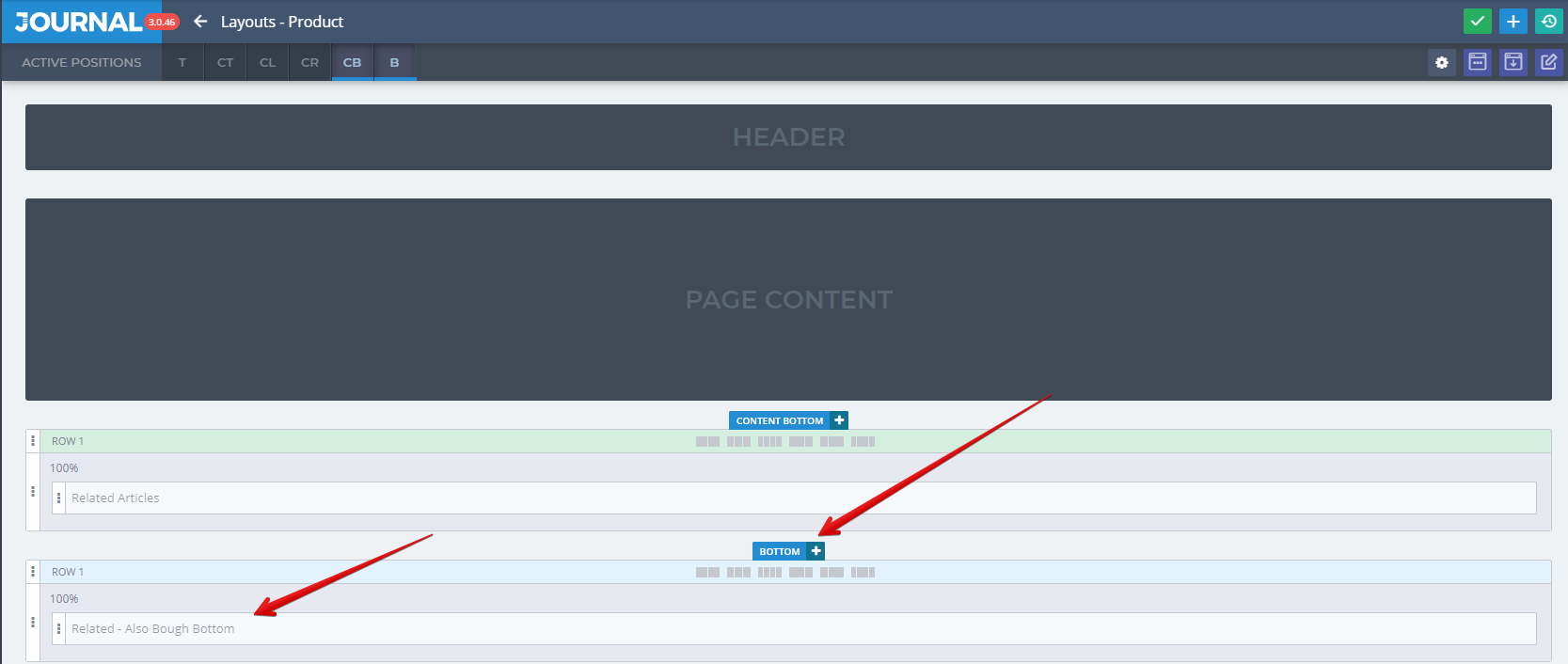
Products is assigned to layout in Journal > Layouts > Product..., in this example in the Bottom position, Row1.
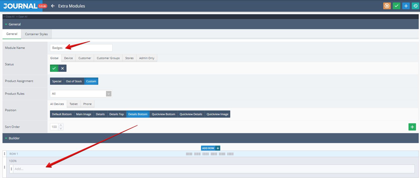
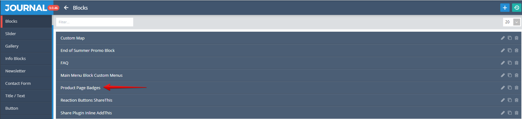
- Blocks Product Page Badges is used in this case for displaying some product badges. Please notice that "Product Page Badges" is a name used in this example.
Storefront View

Admin View
Blocks is created in Journal > Modules > Blocks. Additional settings are available after clicking on the desired product item ("Product Page Badges" in this example).
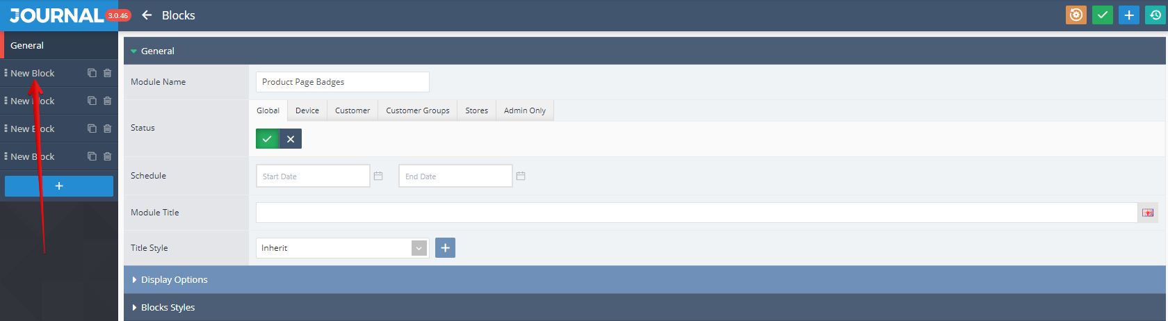
The additional settings are grouped under 2 tabs: General and Block Styles. By clicking once again on the desired item name from the top left side (the 1st "New Block" from the top in this example, marked with a red arrow in the below picture),
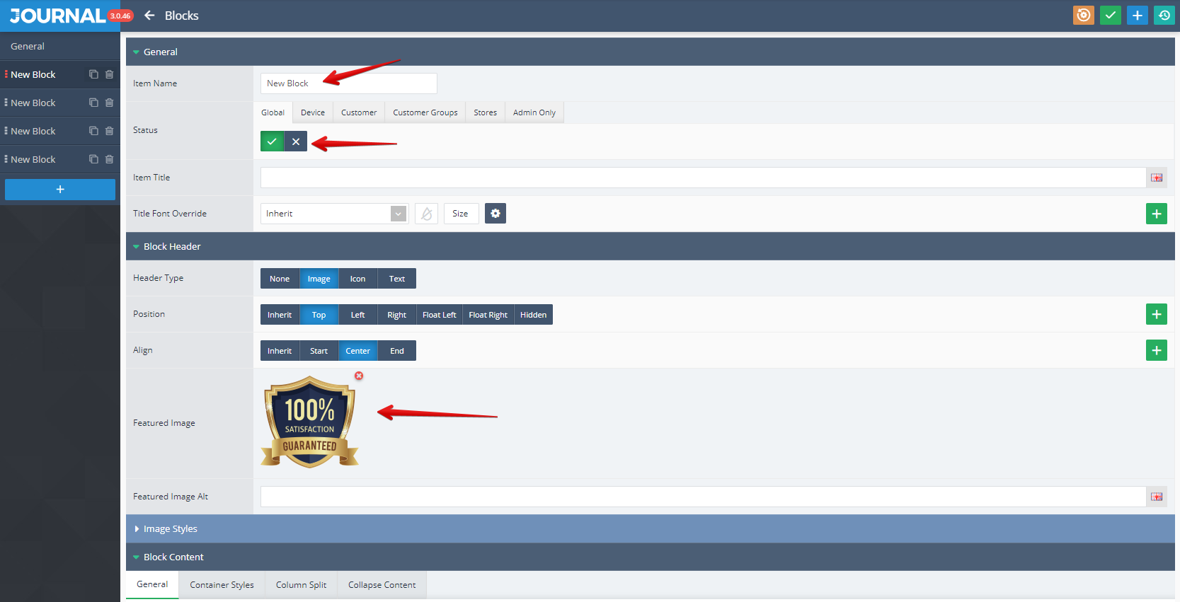
specific settings like Status, Featured Image, Content, Content Type, Align etc. can be access.
Blocks is assigned in Journal > Product Extras > Extra Modules > [Active module] (Badges in this example)... in Row 1.