Items per Row
The Items per Row option allows you to declare how many grid items (products, banners, blocks, etc.) shall be displayed per row, independently for any screen width.
This feature will apply a percentage width on each item within a given grid container. For example, 4 products per row will apply 25% width on each item, 3 per row will apply 33% width and so forth (the formula is 100% divided by number of items per row).
The Items per Row needs to be indicated per breakpoint, as required by your design. See explanations below.
Look for the Items per Row option in any grid module (Banners, Blocks, Products, Gallery, etc.) and everywhere else there are column based elements like the general product listing on category pages in Journal > Skins > Edit > Product Listing > General > Products per Row.
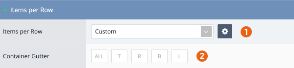
Items per Row Option
-
The Items per Row can be applied as Custom (defined only for the current use case) or pre-defined Items per Row Variables. It's recommended to create and use variables if the same items per row will be used in multiple places, but for one-off uses, the Custom option can be defined as needed.
-
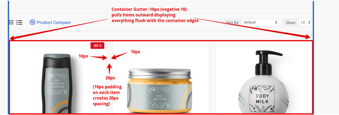
The Container Gutter option is used to offset spacing between items in relation to the parent container in which the items sit. The Spacing option inside the Items per Row popup editor adds padding on each item and the Container Gutter adds margin on the parent container. In order to display items flush with the container edges, a negative gutter is required, exactly half of the spacing used inside the items per row editor.
Items per Row Editor
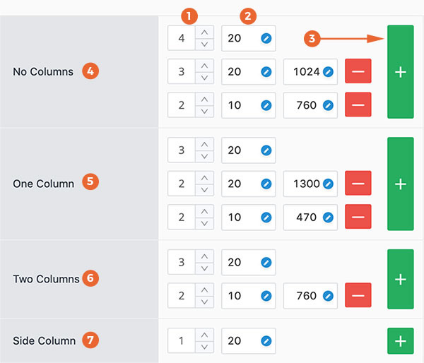
- Items per Row defines the global number of grid items to be displayed per row to be displayed across all resolutions.
- Spacing defines the space between items. It can be use as a Spacing Variable or you can type a custom value in each input field. This feature applies padding on each item. For example, a 20px spacing will add 10px padding on each item, thereby creating a 20px gap in between the items. This works in tandem with the Container Gutter option (see above) which can offset the padding with negative margins on the parent container.
- Breakpoint Rule provides different screen widths at which to define different items per row and spacing. Add as many breakpoint rules as needed to display the desired items per row at any screen width. Breakpoint value can be a variable See Breakpoint Variable or a custom pixel value. To use custom values, type your custom value in the field and click Enter. Then the items per row will apply below that custom width.
- No Columns - applies on layouts where no columns are present in the Content Top and Content Bottom positions, which are the only positions affected by the side columns. No Columns section also applies to modules added in Top or Bottom positions, the Mega Menus or Footer builders since these are not affected by the side columns.
- One Column applies to modules or layouts within the Content Top or Content Bottom positions where at least one column is present on the page. An example would be the category page where a filter module is added to a side column. In this scenario the products per row in the category listing will be governed by the ones within the One Column section.
- Two Columns Same concept as above in One Column but applies to cases where both side columns are present.
- Side Column applies to modules placed in any one of the side columns.
Whenever you set Items per Row for a specific section, such as One Column, and later remove that column from the layout, make sure to also define corresponding Items per Row for the No Columns section, as that section will come into effect once the column is removed. Likewise, Two Columns will come in play when you create a layout with two column.