Main Menu
The Main Menu is a very advanced menu building module. It supports simple multi-level categories dropdowns as well as robust and feature rich mega menu dropdowns with page builder support.
Main Menu Workflow
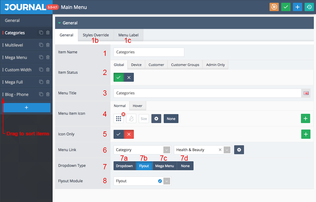
See below explanations:
-
Create one or more Main Menu modules in Journal > Header > Main Menu.
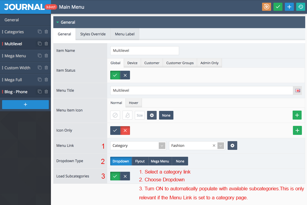
- Menu Item Name seen in the admin. Use the vertical dots icon on the left to drag menus and change sort order.
- Style Override. By default the main menu module uses the Menu Item Style applied in the header module, but you may style each menu differently than the others here.
- Menu Label. Each main menu item can have a custom label applied from here. The label uses the Menu Label style from Journal > Styles > Menu Label so make sure to create some styles first.
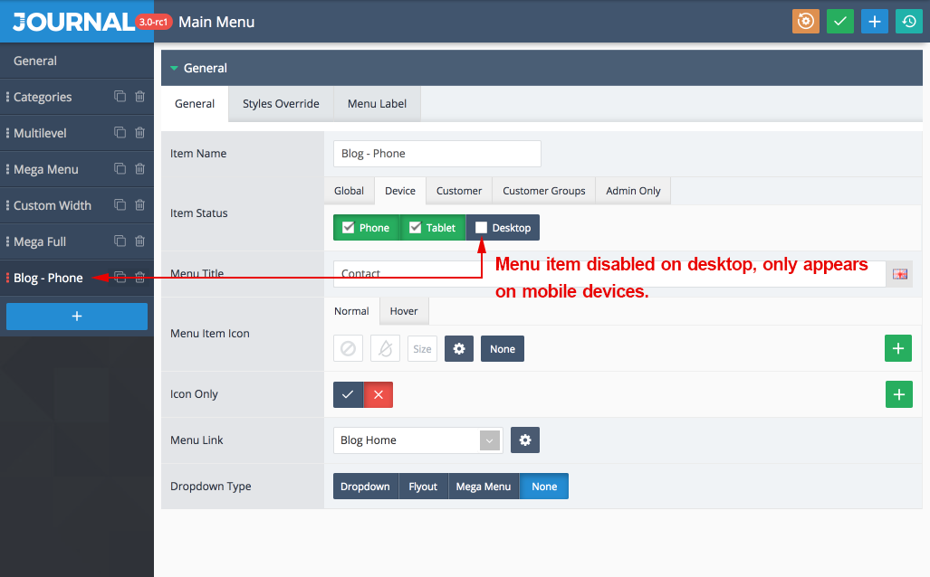
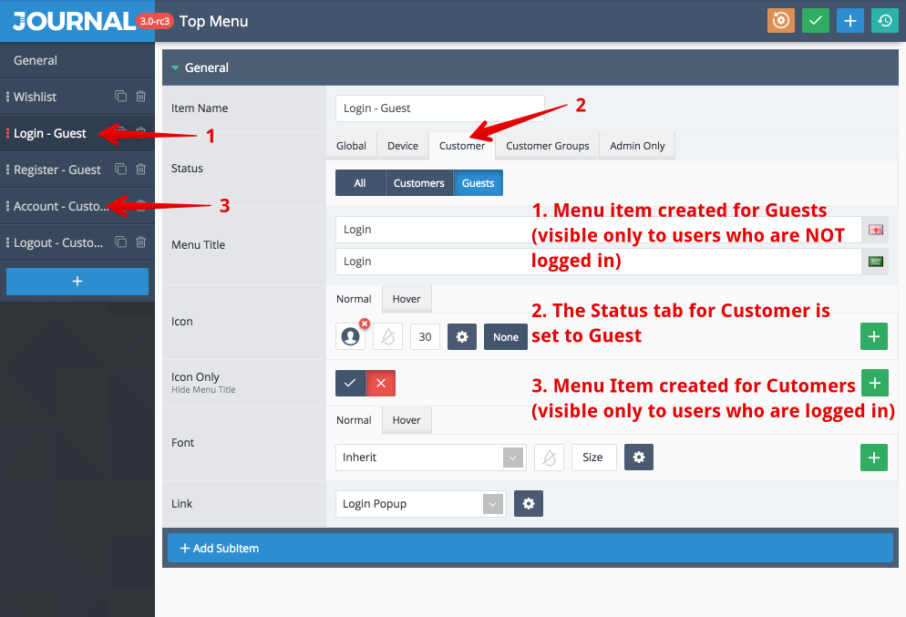
- Menu item status. You may create conditional menu items that only appear on specific devices or users (guests, customers, customer groups, etc.)
-
Menu title seen in the storefront.
-
Optional custom icon.
-
Hides menu text and displays the icon only.
-
The link where the menu item should navigate.
-
The menu dropdown type
- Dropdown - displays normal dropdown or multi-level subcategories.
- Flyout. Create the Flyout module separately in Journal > Modules > Flyout Menu.
- Mega Menu. The mega menu uses the layout page builder. For category links the best module is the Catalog module found in Journal > Modules > Catalog, but any other compatible module may be used.
- None. Choose this option for simple menu items that don't require any dropdown.
- Dropdown - displays normal dropdown or multi-level subcategories.
-
Dropdown menus or modules, based on the dropdown type.
- Menu Item Name seen in the admin. Use the vertical dots icon on the left to drag menus and change sort order.
-
Assign the menu module to the active header in Journal > Header > Active Header > Main Menu > Menu Module. You can see which header is active in Journal > Skins > Header > Desktop Header.
-
Apply Menu Style. Styles for the menus are created in Journal > Styles > Menu Item. You may create unlimited styles and activate each one in different headers. Additionally, each menu item can be styled differently directly from the Main Menu module.
-
Activate various other options available for the main menu in each header.
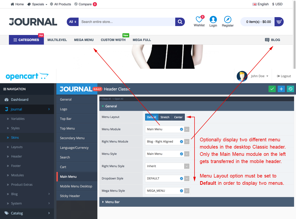
The Classic header can display two different menu modules. This is useful when you want to have some menu items on the left and others on the right.
