Demo 2 Home Page
Home Page has the following elements (scroll down for numbered explanations):
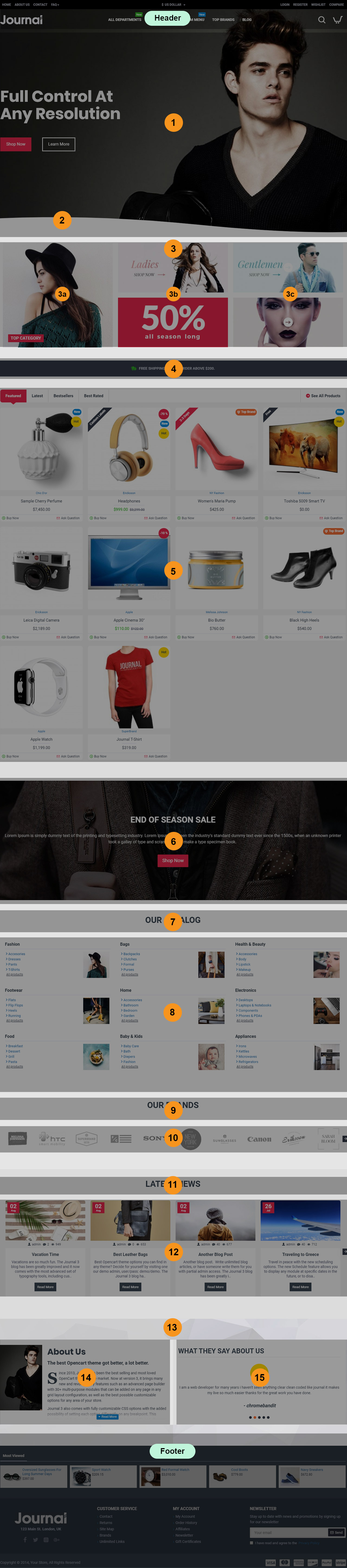
Header is created in Journal > Header > Compact... and it is activated in Journal > Skins > Edit > Header > Desktop Header. For more information related to the Header, please read the documentation on Demo Header.
-
Slider Slider Top Home, created in Journal > Modules > Slider. Assigned to layout in Journal > Layouts > Home... in the Top position > Row 1.
-
Wave Background, created in Journal > Layouts > Home > Row 2 > Row Options > Background > Wave Background. The row options are accessed via the small pencil button seen when hovering over the row.
-
Grid Banners Grid, created in Journal > Modules > Grid. Assigned to layout in Journal > Layouts > Home... in the Top positions > Row 2. Note: The grid module is just another page builder into which you can add other modules, allowing you to create nested builders and more complex layouts.
3a.Categories Top Category Home, created in Journal > Modules > Category. Added in the parent Grid module in Journal > Modules > Grid > [Active Module] > Row 1 > Column 1.
3b.Banners Sample Banners Middle Home, created in Journal > Modules > Banners. Added in the parent Grid module in Journal > Modules > Grid > [Active Module] > Row 1 > Column 2.
3c.Banners Sample Banners Right Home, created in Journal > Modules > Banners. Added in the parent Grid module in Journal > Modules > Grid > [Active Module] > Row 1 > Column 3.
-
Info Blocks Free Shipping Qualifier, created in Journal > Modules > Info Blocks. Assigned to layout in Journal > Layouts > Home... in the Top position > Row 3.
-
Products Featured Products - Home Page, created in Journal > Modules > Products. Assigned to layout in Journal > Layouts > Home... in the Top position > Row 4.
-
Blocks End of Season Promo Block, created in Journal > Modules > Blocks. Assigned to layout in Journal > Layouts > Home... in the Top position > Row 5. This row uses a background image added in the row options, Background section. The row options are accessed via the small pencil button seen when hovering over the row.
-
Title/Text Our Catalog Title, created in Journal > Modules > Title/Text. Assigned to layout in Journal > Layouts > Home... in the Bottom position > Row 1.
-
Catalog Our Catalog Home Layout, created in Journal > Modules > Catalog. Assigned to layout in Journal > Layouts > Home... in the Bottom position > Row 1.
-
Title/Text Our Brands, created in Journal > Modules > Title/Text. Assigned to layout in Journal > Layouts > Home... in the Bottom position > Row 2.
-
Brands Brands Layout, created in Journal > Modules > Brands. Assigned to layout in Journal > Layouts > Home... in the Bottom position > Row 2.
-
Title/Text Blog Title, created in Journal > Modules > Title/Text. Assigned to layout in Journal > Layouts > Home... in the Bottom position > Row 3.
-
Posts Blog Posts Home, created in Journal > Modules > Blog Posts. Assigned to layout in Journal > Layouts > Home... in the Bottom position > Row 3.
-
Row Background Image. This row has a fixed background image added in the row options, Journal > Layouts > Home... in the Bottom position > Row 4 > Row Options > Background. The row options are accessed via the small pencil button seen when hovering over the row.
-
Blocks About us, created in Journal > Modules > Blocks. Assigned to layout in Journal > Layouts > Home... in the Bottom position > Row 4.
-
Testimonials Testimonials, created in Journal > Modules > Testimonials. Assigned to layout in Journal > Layouts > Home... in the Bottom position > Row 4.
Footer is created in Journal > Footer... and it is activated in Journal > Skins > Edit > Footer > Desktop Footer. For more information related to the Footer, please read the documentation on Demo Footer.