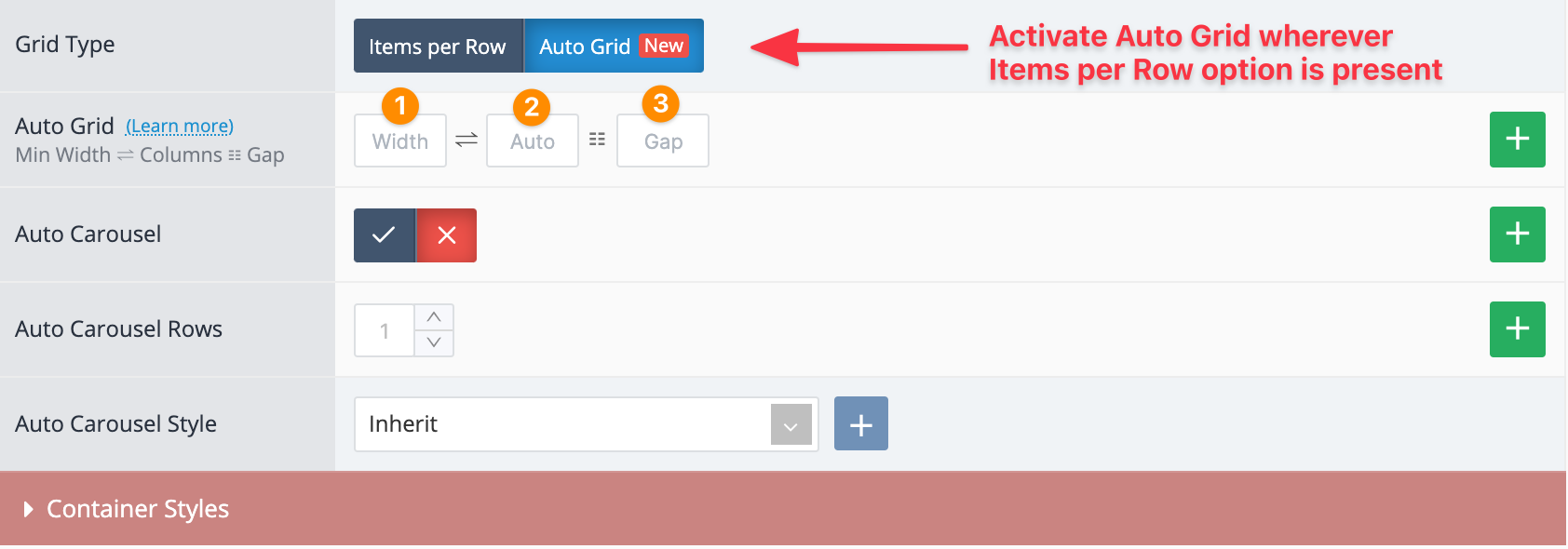
Auto Grid & Auto Carousel
Auto Grid and Auto Carousel are meant to replace the existing Items per Row and Carousel Mode features but are optional, the old Items per Row and Carousel Mode still work as usual and can continue to be used like before.
Auto Grid
The new auto-responsive repeater grid system aims to ease the responsive workflow for repeater grids like product grid or other modules with multiple items that are the same width. It is based on new and modern web technologies that embrace intrinsic responsive design.
-
Item minimum width in pixels. Each item will grow in width to fill the available space, up to the point where more items can fit on the same row. For example a width of 150 would roughly display 7 items on screens bigger than 1200px (Gap is also taken into account and subtracted from the calculation). As the screen becomes smaller, the items will auto adapt and display as many as it can fit in the container, thereby creating rows as needed without necessitating any breakpoints (although breakpoints can still be used for more granular control).
-
Max Columns (Items per Row). This is optional and offers a more familiar percent-based item width and works like the Items per Row (100% / columns). This only works when the computed width of each item (in %) is greater than the minimum pixel width indicated in the previous option. For example 4 columns will make each item 25%, but only if each computed item width in percent is greater than the minimum pixel width indicated in the previous option. This is useful because it eliminates the risk of having too many columns on smaller screens or parent containers. Breakpoint rules can still be used as needed. If you wisth to always use the percent-based column approach, input 0 in the Width option and the number of columns indicated will apply on any screen width. In such cases you can just add breakpoint rules to change the number of columns. If Auto Carousel is activated, you can also use decimals in the Max Columns, like 3.4 where 3 full items + 40% of the last item will be visible.
-
Gap. This adds space between the items (default 10). If you want no gap between items input 0.
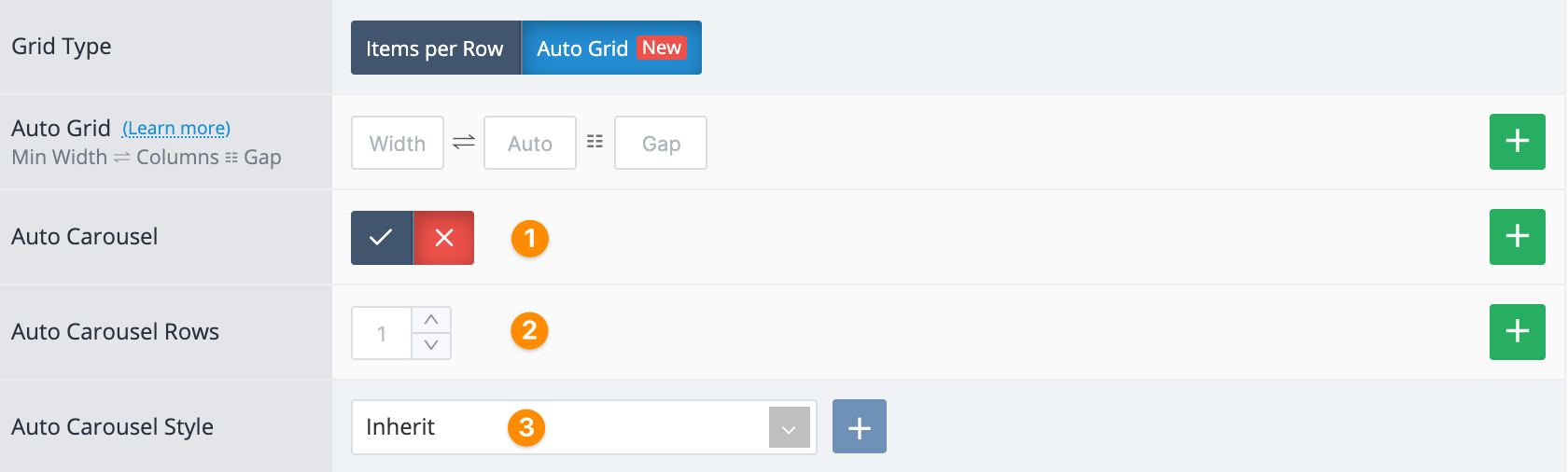
Auto Carousel
New Auto Carousel mode works seamlessly with the new Auto Grid system using the same item width values. It is scroll-based and leverages browser scroll snapping for best possible performance. Allows natural clipping of the last item to clearly indicate there are additional items to be scrolled into view and also provides support for multi-row carousels. This replaces the old Carousel Mode mechanism that is part of the legacy Items per Row system.
-
Activate Auto Carousel. The switch from grid to carousel (and vice-versa) is CSS-based and done instantly and can be activated at any screen width via breakpoint rule.
-
Carousel Rows creates a vertical grid with up to 5 rows (items per column). It's only effective when there are sufficient items available to generate scroll. Works great in modules with a large number of small-sized items. All rows should be in the visible area of the viewport. Do not use with large vertical items that may extend outside the bottom of the viewport.
-
New Auto Carousel style. Create the style in Journal > Styles > Auto Carousel... Apply it globally in Journal > Skins > Edit > Global > Global Styles > Other Styles > Auto Carousel. Global style applies on all carousel at once. You can create different styles to apply to different modules.
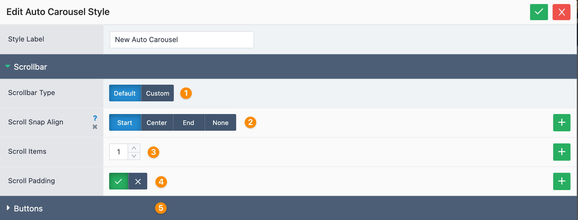
Auto Carousel Style
-
Choose scroll bar type. Since the new carousel is scroll based, it can use the default browser scroll bar or a custom one for which we provided customizable options.
-
Provides browser native scroll snapping. This is useful on touch devices when swiping the carousel sideways with the finger. It provides smooth snapping in place of each slide.
-
Number of items to scroll by when clicking the next/prev buttons.
-
Adds the gap value as spacing before the first item in the carousel.
-
Custom styles for the new carousel Next/Prev buttons.