Breakpoints Variable
The Breakpoint Variable defines a screen width at which other options may be set in different ways.
They are defined in Journal > Variables > Breakpoints.
This screen width appears in the Breakpoint Rule found as a green + button on the side of any CSS-based option
throughout the admin. 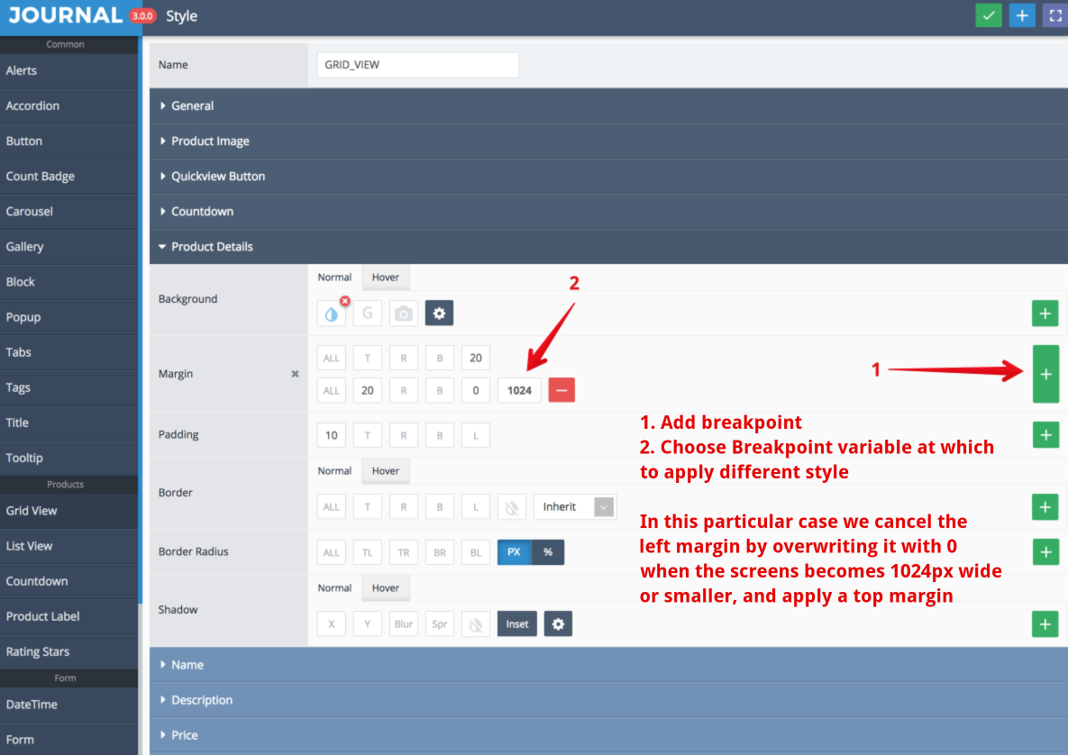
Multiple breakpoint variables may be created, but usually the 5 main values will suffice (Phone, Phone Large, Tablet, Desktop, Desktop Large). However, should your design require a CSS based option to be modified at a certain screen width feel free to create as many breakpoints as you need.