General Info
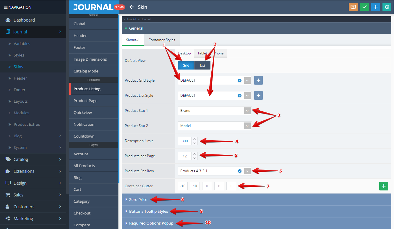
Options for the Product Listing are handled in Journal > Skins > Edit > Product Listing > ...
-
Grid Style. This style is selected if the button labeled "Grid" from the Default View option is pushed. For detailed explanations about how the Grid Style is working please see our documentation on Product Grid Style.
-
List Style. This style is selected if the button labeled "List" from the Default View option is pushed. For detailed explanations about how the List Style is working please see our documentation on Product List Style.
-
Product Stat 1 and Product Stat 2 can be selected from a list of possible Stats described in the Product Details (Brand, Model, SKU, UPC, Weight, Dimensions, Reward Points, Stock, Quantity etc.). These can be styled in Journal > Styles > Product Page > [Active Style] > Product Details > Stats > ....
-
Description Limit is used for setting the short description character limit.
-
Products per page dictates how many products should be loaded on the first page of your listing (before pagination or the "Load More" infinite scroll mechanism si activated).
-
Products per row can be selected from a list of predefined variables from Journal > Variables > Items per row > .... If the Quick Edit is selected (click on the blue small pencil button) the Item per row Variable can be edited. Learn more about this here.
-
Container Gutter allows you to control the Item per rows spacing for the product Grid View.
-
Zero Price section allows you to set up the behaviour of Journal in case the price is set to zero. In this case, both the price itself and Add to cart button can be hidden.
-
Buttons Tooltip Styles section allows you to select a predefined style for the following tooltips: Quickview, Cart, Whishlist, Compare and Extra. It uses a Tooltip style created in Journal > Styles > Tooltip > ...
-
Required Options Popup In this section you can enable/disable the required options popup, as well as apply custom styling options on the popup.
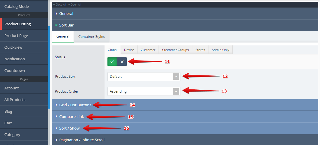
The next settings are grouped under the Sort Bar tab and are described in the numbered explanations below the image.
-
Status Here you can enable/disable the entire Sort Bar.
-
Product Sort allows for the selection of the Sorting Criteria.
-
Product Order Here you can choose Ascending or Descending order.
-
Grid / List Buttons This allows changing the listing view style, either Grid or List. In addition there are options for Grid Icon, List Icon, Background, Border Radius, Button Size and Space Between.
-
Compare Link allows you to show or hide the Compare link. In addition there are options for Font, Icon Only, Icon, Padding Count Badge Visibility and Count Badge Style.
-
Sort / Show allows you to show or hide the Sort and/or Show selectors. In addition there are options for Label Font, Label Background, Label Border Radius, Label Spacing nd Input Style.