Demo 6 Product Page
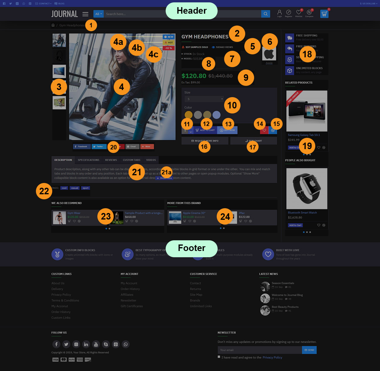
Product Page has the following elements (scroll down for numbered explanations):
Header is created in Journal > Header > Slim... and it is activated in Journal > Skins > Default > Header > Desktop Header. For more information related to the Header, please read the documentation on Demo Header.
-
Breadcrumbs. These can be styled in Journal > Styles > Breadcrumbs > [Active Style]... Breadcrumbs style are added globally in Journal > Skins > Edit > Global > Global Styles > Breadcrumbs.
-
Page Title. Title styles are created in Journal > Styles > Title > [Active Style] (Page Title in this case).... The Page Title style is added globally in Journal > Skins > Edit > Global > Global Styles > Titles > Page Title > Title Style.... Additional options for the product page title are available in Journal > Styles > Product Page > [Active Style] > General > Page Title.
-
Additional Images. These can be styled in Journal > Styles > Product Page > Product Image > Additional Images...
-
Product Image. This can be styled in Journal > Styles > Product Page > Product Image.... You can handle the main image container width from Journal > Styles > Product Page > [Active Style] > General > Page Split Ratio.
4a. Product Labels New, created in Journal > Product Extras > Product Labels. Styles can be created in Journal > Styles > Product Label > ... and applied in each label module.
4b. Product Labels Hot, created in Journal > Product Extras > Product Labels. Styles can be created in Journal > Styles > Product Label > ... and applied in each label module.
4c. Product Labels Sale, created in Journal > Product Extras > Product Labels. Styles can be created in Journal > Styles > Product Label > ... and applied in each label module.
-
Sold - Views. These can be styled in Journal > Styles > Product Page > [Active Style] > Product Details > Stats > Sold - Views...
-
Stock. This can be styled in Journal > Styles > Product Page > [Active Style] > Product Details > Stats > Stock...
-
Model. This can be styled in Journal > Styles > Product Page > [Active Style] > Product Details > Stats > Other Stats...
-
Brand. This can be styled in Journal > Styles > Product Page > [Active Style] > Product Details > Stats > Brand...
-
Price. These can be styled in Journal > Styles > Product Page > [Active Style] > Product Details > Price Group...
-
Options. Options are created in Opencart > Catalog > Options. These can be styled in Journal > Styles > Product Page > [Active Style] > Product Details > Options where a Form style can be used to style the inputs. Additional customizable options are in the Push Options sub-section of the same page.
-
Quantity, styled in Journal > Styles > Product Page > [Active Style] > Buttons > Quantity. This uses a Stepper style created in Journal > Styles > Stepper > ...
-
Add to Cart, styled in Journal > Styles > Product Page > [Active Style] > Buttons > Add to Cart.... This uses Button style created in Journal > Styles > Button > ...
-
Buy Now, created in Journal > Product Extras > Extra Button. This can be styled in Journal > Styles > Product Page > Buttons > Extra Button.... It uses a Button style created in Journal > Styles > Button > .... For more info on how the Extra Buttons work please see the documentation on the Extra Buttons. Also check out the Product Assignment docs to understand the concept of how these are assigned to various products.
-
Wishlist, styled in Journal > Styles > Product Page > [Active Style] > Buttons > Wishlist / Compare > Wishlist.... This uses Button style created in Journal > Styles > Button > ...
-
Compare, styled in Journal > Styles > Product Page > [Active Style] > Buttons > Wishlist / Compare > Compare.... This uses Button style created in Journal > Styles > Button > ...
-
Button Request Info, created in Journal > Modules > Button. Assigned in Journal > Product Extras > Extra Modules > [Active module] (Request Info - Size Guide Buttons in this case)... in Row 1. It uses a Button style created in Journal > Styles > Button > ....
-
Button Size Chart, created in Journal > Modules > Button. Assigned in Journal > Product Extras > Extra Modules > [Active module] (Request Info - Size Guide Buttons in this case)... in Row 1. It uses a Button style created in Journal > Styles > Button > ....
-
Info Blocks Product Page - Vertical Blocks, created in Journal > Modules > Info Blocks. Assigned to layout in Journal > Layouts > Product... in the Column Right position > Row 1.
-
Products Side Column - Related Also Bought, created in Journal > Modules > Products. Assigned to layout in Journal > Layouts > Product... in the Column Right position > Row 1.
-
Blocks Share Plugin Inline AddThis, created in Journal > Modules > Blocks.... Assigned in Journal > Product Extras > Extra Modules > Share Buttons in Row 1.
-
Product Tabs, created in Journal > Product Extras > Product Tabs. Please read the documentation on Product Tabs.
21a. Collapse Content. This feature can be controlled from the tab module, in this case in Journal > Product Extras > Product Tabs > [Description] > Content > Collapse Content. Additional global styles for this feature are found in Journal > Skins > Edit > Global > Collapse Content.
-
Tags. These can be styled in Journal > Styles > Product Page > Product Details > Tags...
-
Mini Products We also recommend (Same category), created in Journal > Modules > Mini Products. Assigned to layout in Journal > Layouts > Product... in the Content Bottom position > Row 2.
-
Mini Products More from this brand, created in Journal > Modules > Mini Products. Assigned to layout in Journal > Layouts > Product... in the Content Bottom position > Row 2.
Footer, created in Journal > Footer > Footer.... Activated in Journal > Skins > Default > Footer > Footer. For more information related to the Footer, please read the documentation on Demo Footer.