Color Schemes
Color Schemes are a new optional approach that allows you to switch entire color sets based on various pre-defined color tokens. A color scheme contains colors for foreground, background, branding, primary button, etc.
Color schemes are created in Journal > Variables > Color Schemes.
allow you to define as many colors as you want and use them throughout the admin.

Inside a scheme you can assign individual color tokens and create Light, Dark and branded color schemes. We incorporated 3 levels of shades for foreground and background: Primary, Secondary, Tertiary. You can use tokens and the Lightness option from the color picker.
Once Color Scheme are created you can assign these values throughout the admin. A new option to select a Color Scheme value is now available in the color picker.

- In the button style example we select the pre-defined color scheme value of Button / Foreground for the button text.
- In the button background we select the value of Button / Background.
Options throughout the admin from the various styles to individual elements can have one of the color schemes values assigned.
Text or icons will get on of the foreground colors while background elements will get one of the background colors (primary, secondary, etc.).
Global scheme is applied in Journal > Skins > Edit > Global Styles > Color Scheme. This will apply to the entire site unless a particular section has a different scheme.
With individual options set to a Color Scheme value, entire sections such as headers, rows or columns can use a different color scheme.
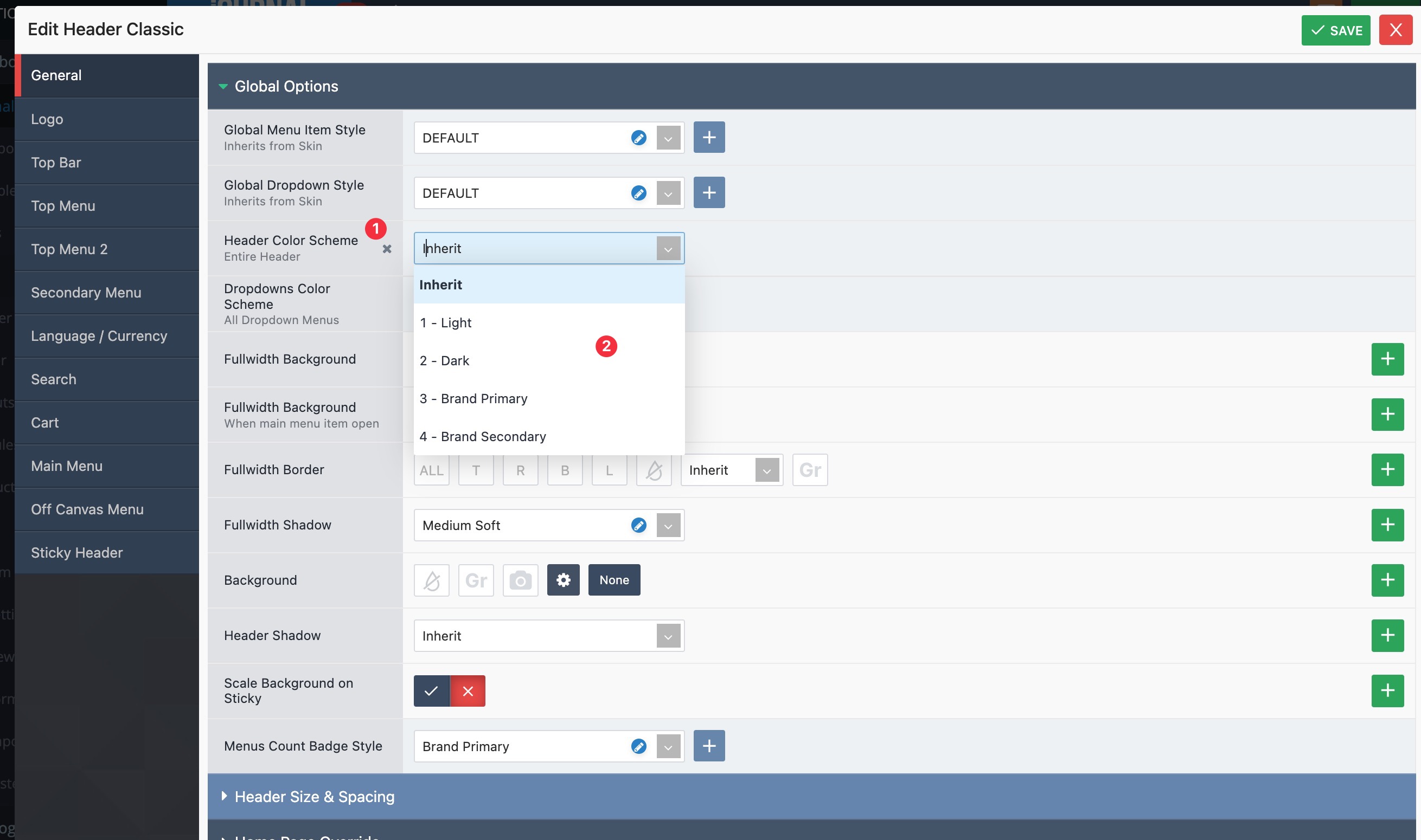
- Locate the Color Scheme option.
- Assign a different scheme.
With this in place you can have various sections rapidly use different colors.