Mobile Workflow
Journal 3 employs optional dedicated mobile layouts. This means you can create custom modules (sliders, blocks, banners, etc.), entire menus or individual menu items specific to phones, tablets or desktops.
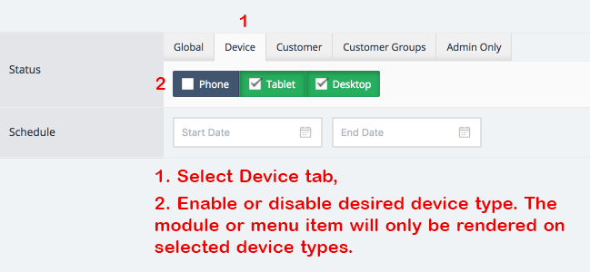
By default modules and menu items are rendered on all devices (phones, tablets, desktops) but it's important to note that one can leverage the option to create specific modules for specific use cases for best performance across all devices.
note
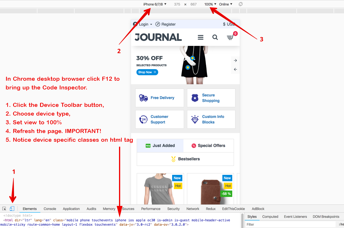
Make sure to use actual mobile devices when testing dedicated mobile layouts as module status is device-specific. In other words don't just resize the desktop browser to see the device specific modules, you need an actual mobile user agent. If you don't have a mobile device handy you can use the Chrome desktop browser
Headers
There are 3 different types of dedicated mobile headers found in Journal > Header > Mobile Header x. Each header contains core header elements such as Main Menu, Cart, Search, Top Menu, Language and Currency.
- Create one or more mobile header modules and customize them as desired. Unlimited instances of each of the 3
different mobile header modules can be created and each can have completely different styles or load completely
different menu modules.
- The Main Menu module transfers automatically into the mobile off canvas container, (called Mobile Wrapper). However, each mobile header has the option to load a completely different main menu module so feel free to create different menu modules for mobile if so desired. Or you can keep the same menu module but selectively enable/disable individual menu items for each device.
- Top Menu does not get transferred automatically and it must be chosen manually inside the mobile header in Journal > Header > Mobile Header x > Top Menu > Top Menu Module. It's recommended to not use the same Top Menu module from desktop if it has too many menu items. Create a separate Top Menu module with only the essential menu items such as Login and Register which properly fits within the top bar of your mobile header.
Breakpoint Designer
One of the most cutting edge features in Journal 3 is the CSS breakpoint designer. Total and complete control over any element on ANY screen width. Need to adjust a CSS based option on a particular screen width? Simply click on the green + button available in any CSS based option, indicate the screen width via the breakpoint variable and modify the option as desired.
Modules
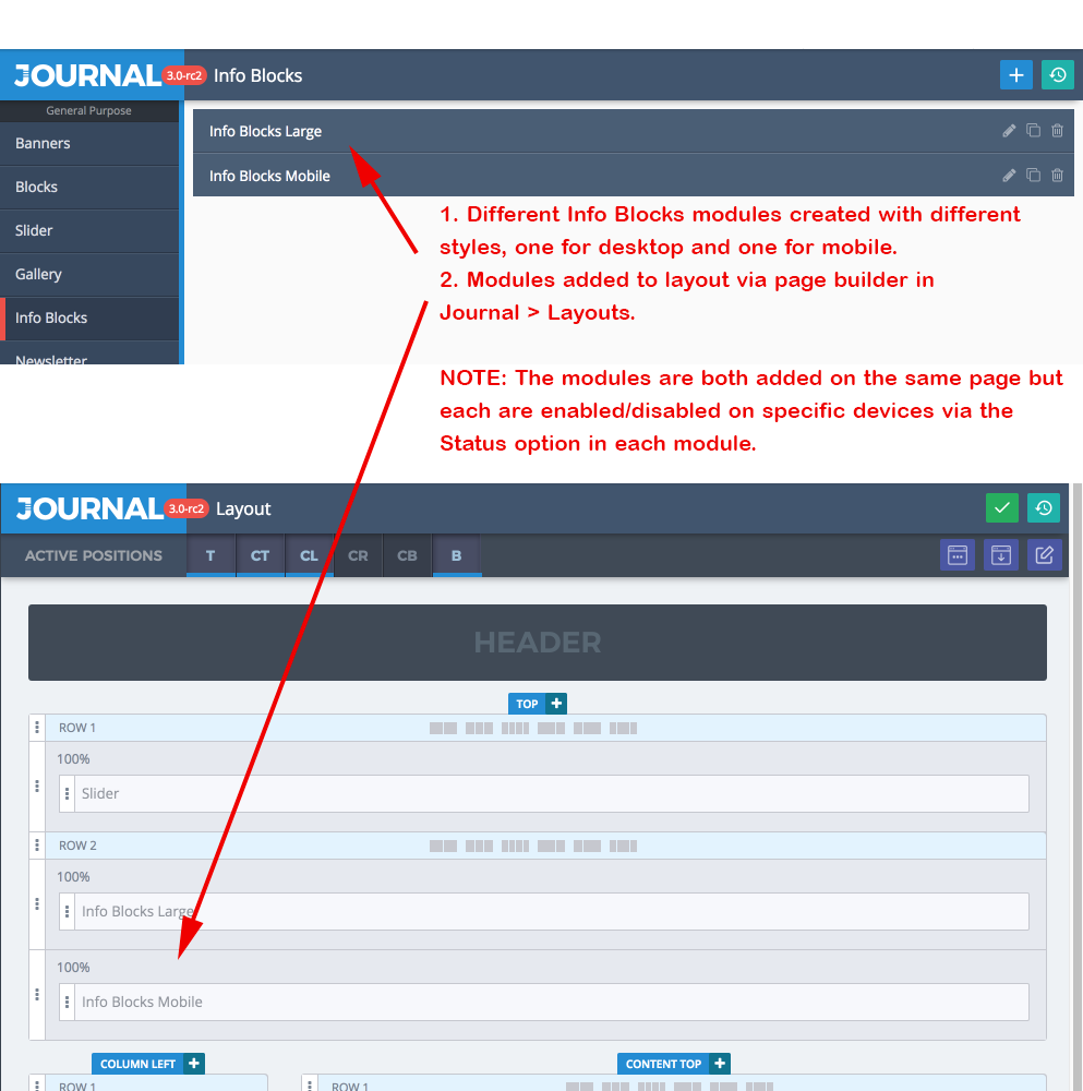
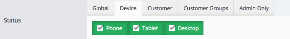
It is highly recommended to create lighter modules for phones for optimum performance. For example you may have a Slider module or large menu system which works well on desktop but is quite heavy or doesn't look as desired on phones. In such cases you can disable these modules on phones and/or tablets via the Status option found in every module
 and create separate instances of each module which in turn are disabled on Desktop and enabled on Tablet or Phone via the same **Status** option.
Actual Use Case
In our basic Journal 3 demo we created separate Info Blocks modules for desktop and mobile
in our basic J3 demo.