Blocks
The Blocks module allows you add any HTML content to you site very easily. You can add single blocks spanning the entire width of your site, or multiple blocks grouped together in a grid.
General Options
- Common Settings - See Common Settings
- Additional Settings
- Selected Item - Controls which item should be selected by default when using Display as tabs or accordion.
- Display - Controls how items are displayed in frontend (as blocks, as tabs or as accordion).
- Module Typography - Overwrites the default typography style from the skin.
Block Styles
General
- Content Align / Vertical Align - Controls how block content is aligned horizontally / vertically.
- Content Max Width - Controls the max with of the block content.
- Font - Controls block content font.
- Background - Controls block content background.
- Padding - Controls block padding.
- Border / Border Radius - Controls block border and border radius.
- Shadow - Controls block shadow.
Title
- Blocks Title Style - Allows title style overwrite for current blocks module.
- Title Align Override - Allows title align overwrite.
- Position to Header - Whether to position the title before or after the block's header (icon or image).
- Margin - Controls block title margin.
Header
- Position - Controls where is the title displayed (top, left, right, float left or float right).
- Align - Alignment of the icon or image.
- Icon - Allows to use an icon as header.
- Global Icon -
- Icon Container Size -
- Icon Margin -
- Icon Background -
- Icon Border -
- Border Radius -
- Icon Shadow -
- Image - Allows to use an image as header.
- Image Dimensions -
- Image Margin -
- Border -
- Border Radius -
- Image Shadow -
Item Options
- Item Name - Name of the item seen in admin on the left side of the module to easily describe what that item represents.
- Status - Status of the item.
- Item Title - Name of the block title shown as header.
- Title Font Override - Allows to override the global font used for title.
Block Header
- Header Type - Allows to add icon or image as module header.
- Position - Controls where is the image or icon displayed (top, left, right, float left or float right).
- Align - Controls how image or icon is aligned.
- Featured Image / Icon - Image or icon to be used in block header.
Block Content
- Content Type - Controls what type of content to show in block.
- Code / Plain Text - Allows to use plain text or html code in block content. This field is mainly used for displaying text or html code which is not altered in any way by the WYSIWYG editor (CKEDITOR or Summernote). Also, this option should be used when wanting to embed custom widgets (scripts) like Share This / Add This / Adwords / etc.
- HTML Editor - Allows to use a WYSIWYG editor (CKEDITOR or Summernote) to add block content. From the editor you can apply different styles using an intuitive visual editor.
- Map - Allows to add a Google Map embedded script. It will also style the map in order to be responsive (the same thing can be done with Code / Plain Text but it won't have additional styling added in order to properly display the code).
- Facebook - Allows to add a Facebook Like Box embedded script. It will also style the box in order to be responsive (the same thing can be done with Code / Plain Text but it won't have additional styling added in order to properly display the code).
- Twitter - Allows to add a Twitter Box embedded script. It will also style the box in order to be responsive (the same thing can be done with Code / Plain Text but it won't have additional styling added in order to properly display the code).
- Description - Allows to dynamically show Product / Category Description based on current product / category. This only works on product / category pages.
- Short Description - Allows to dynamically show Product / Category Short Description based on current product / category. Short Description is generated based on product / category description but you can define how many characters should be displayed. This only works on product / category pages.
- Product Specifications - Allows to dynamically show Product Attributes based on current product. This only works on product pages.
- Product Reviews - Allows to dynamically show Product Reviews based on current product. This only works on product pages.
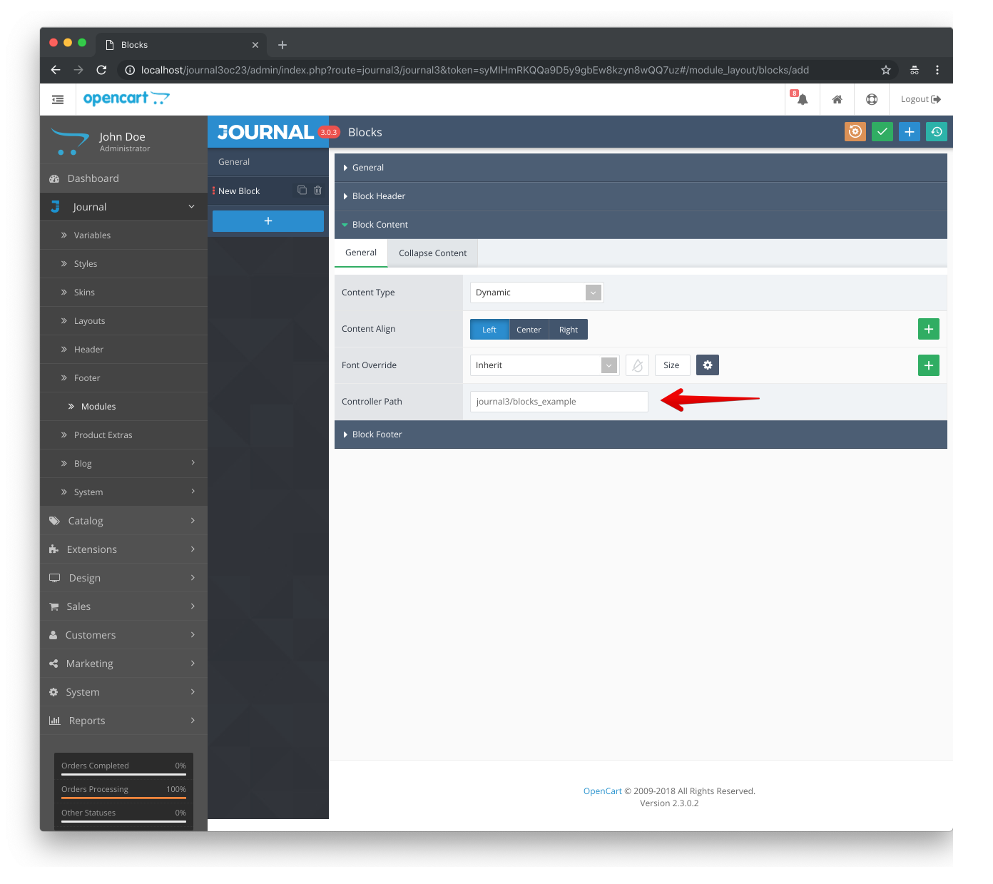
- Dynamic - Allows to dynamically execute a custom Opencart controller in order to programatically show content in a block. This feature requires advanced Opencart programming knowledge and is intended for advanced users (programmers) or third party extensions developers to better integrate their extensions (especially on product pages). See Dynamic Blocks.
- Typography Style - Allows to override typography style for block content when Content Type is set to Code / Plain Text or HTML Editor.
- Content Align - Allows to override content align for block content.
- Font Override - Allows to override font for block content.
- Content Max Width - Defines the max with for block content.
- Content - Block Content to be displayed in frontend.
Block Footer
- Footer Type - Controls what type of footer to show after block content.
- Text - Shows a simple text as block footer.
- Button - Shows a button as block footer, usually used for call to action elements.
- Border Radius - Controls footer border radius.
- Scale Origin - Point from which to apply scaling.
Dynamic Blocks
You can use Dynamic option to execute a controller file in order to generate dynamic content in Blocks module. To do that, you must first create a controller file and then specify its path in admin.
Theme comes with an example, you can find it in catalog/controller/journal3/blocks_example.php
To use that controller in a Blocks module, enter journal3/blocks_example in Controller Path.
note
We use standard Opencart MVC-L architecture, you can find more information about this in Opencart documentation.